Deliver bank card; melt faces
Mar 06, 2020 · Building Up
Here at Up, we strive to create experiences that change your perception of what a bank should look like and how it should act. In a world where instant digital satisfaction and gratification is rife, we want the scarce physical interactions people have with Up to be potent. How could we crank up the heat on our current welcome pack and melt some faces?
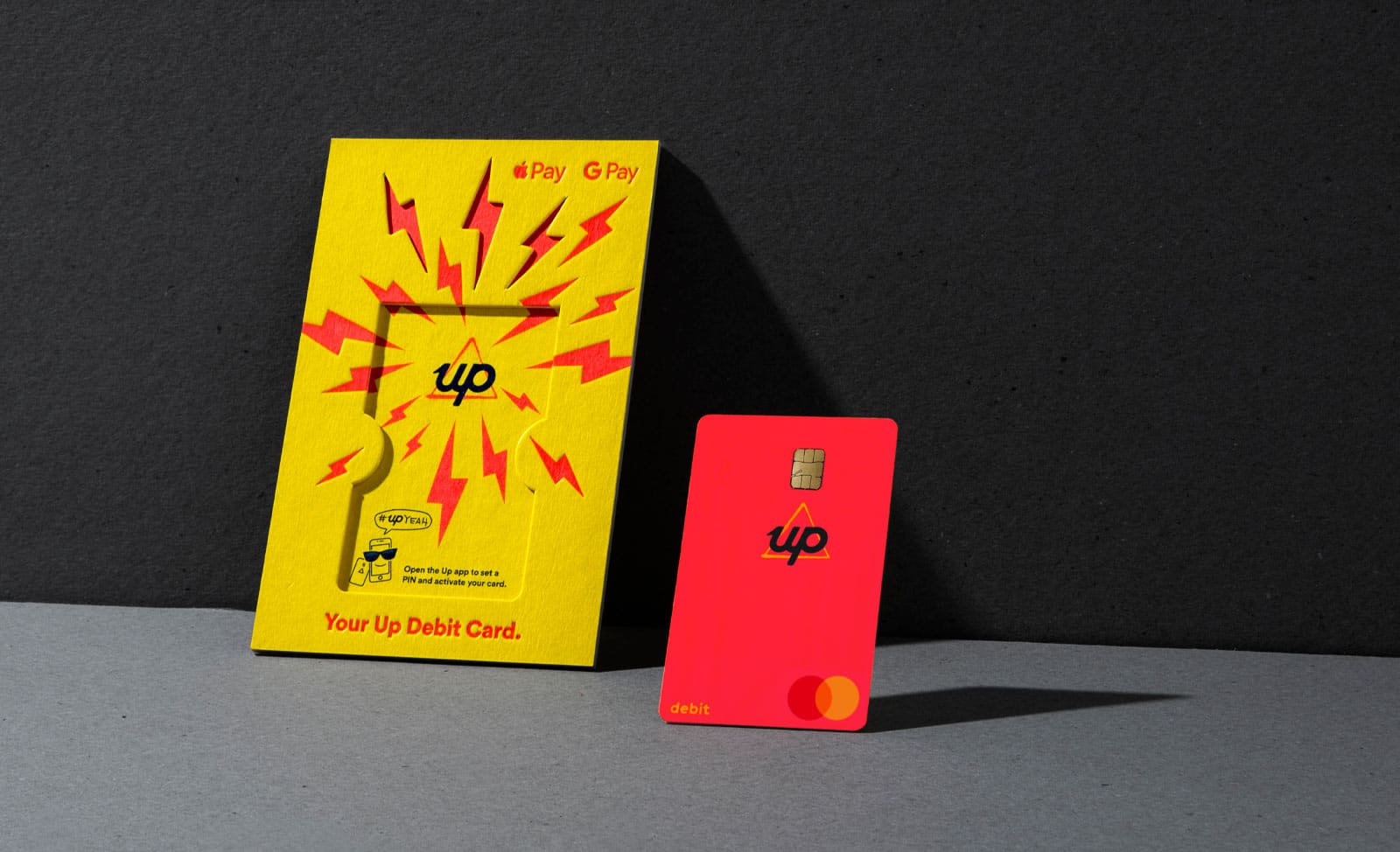
The Welcome Pack Card Holder
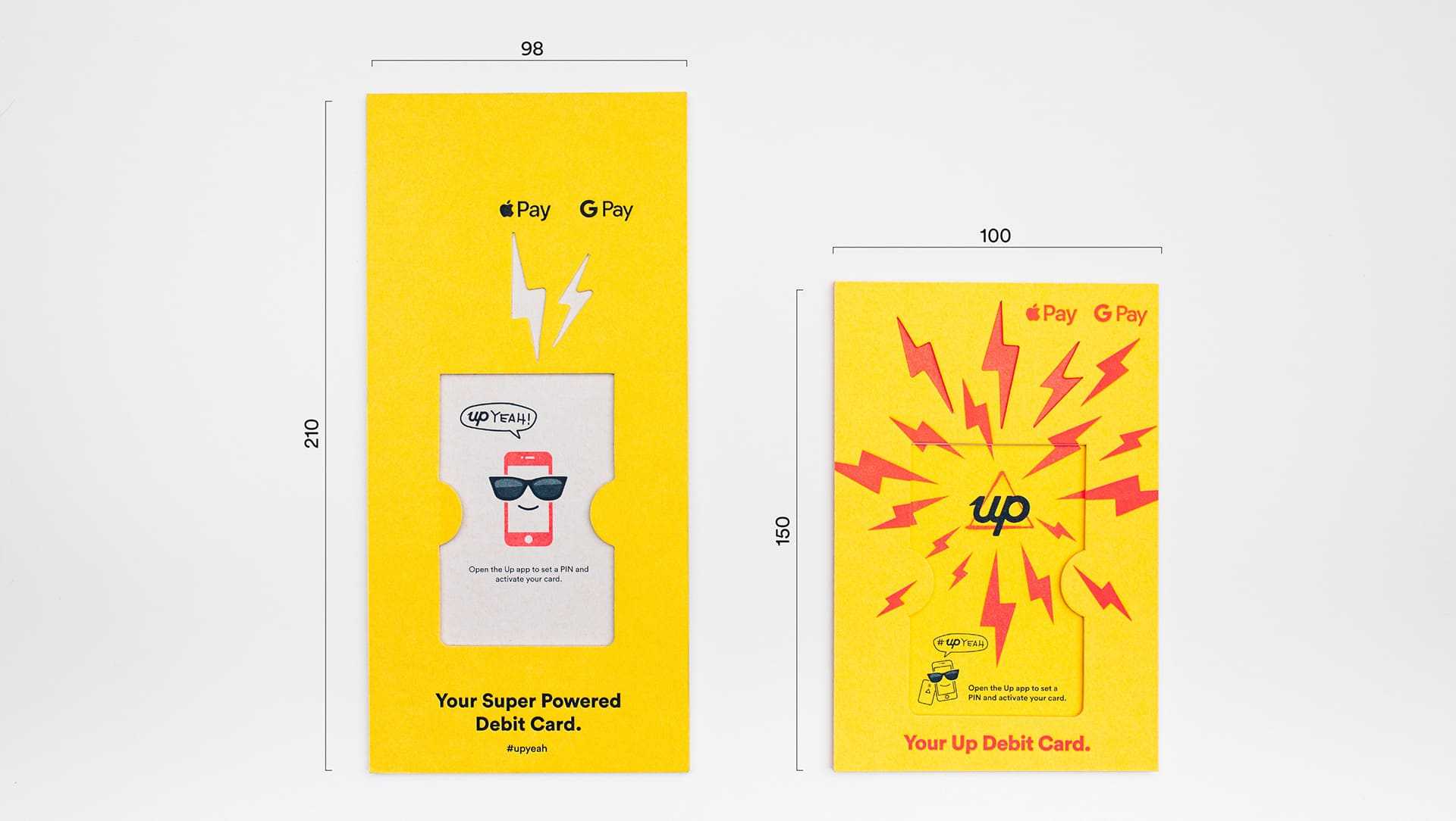
When you think about how a new debit card is traditionally delivered by a bank, it doesn’t usually create a lasting impression. Typically it's a boring piece of white A4 paper delivered in your standard mail envelope. The card you've been eagerly waiting for is stuck to the paper with a thin (sometimes not so thin) stream of hot glue. All up, it's a very forgettable experience and you're left with another disposable piece of landfill.
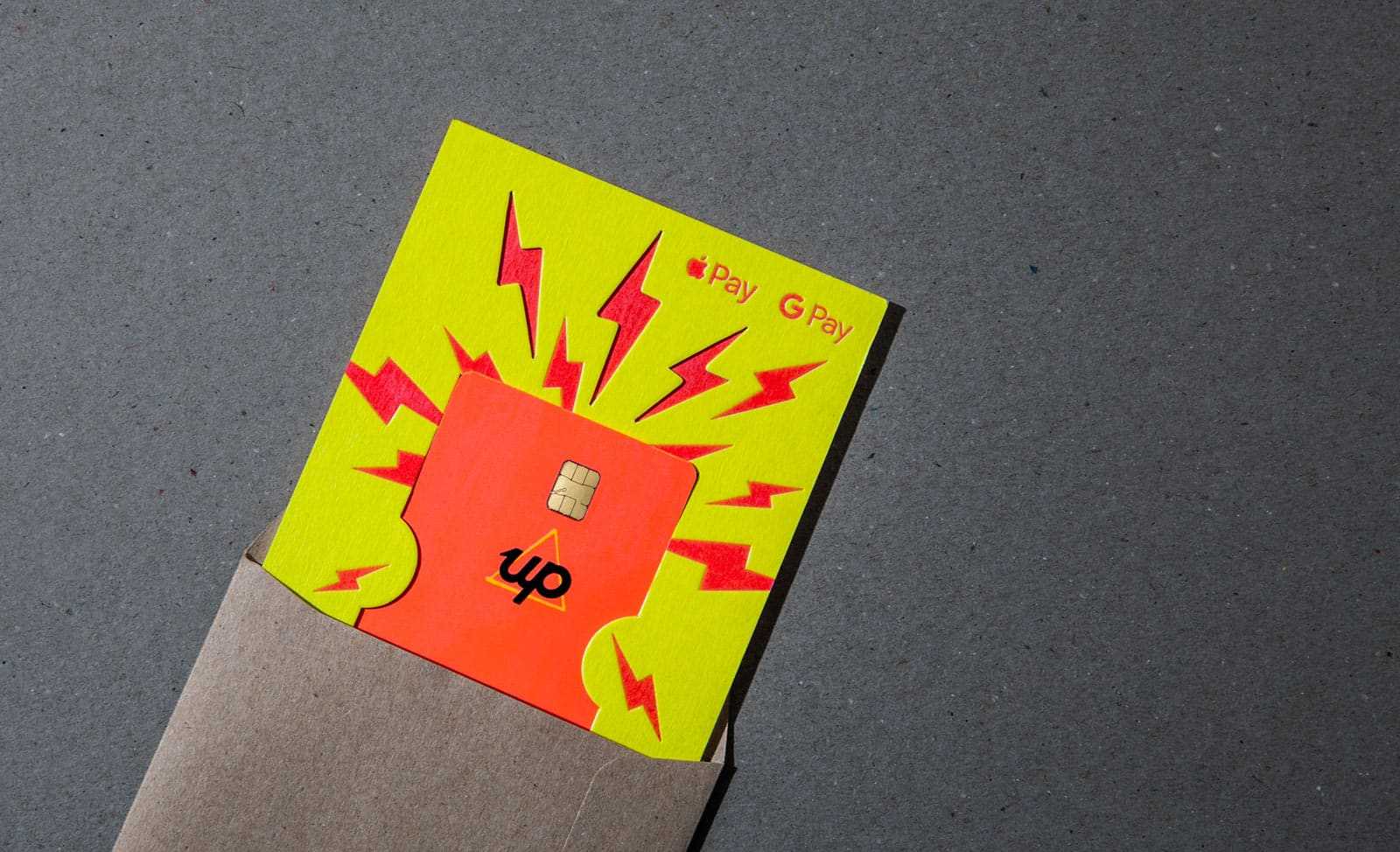
Since we launched we’ve put a lot of effort into making the “unboxing” experience of our mailers memorable, but we wanted to kick it up a notch and use the next iteration as a chance to emphasize our brand values of sustainability, financial literacy and fun…and make something that would bring endless joy to our customers eyeballs..
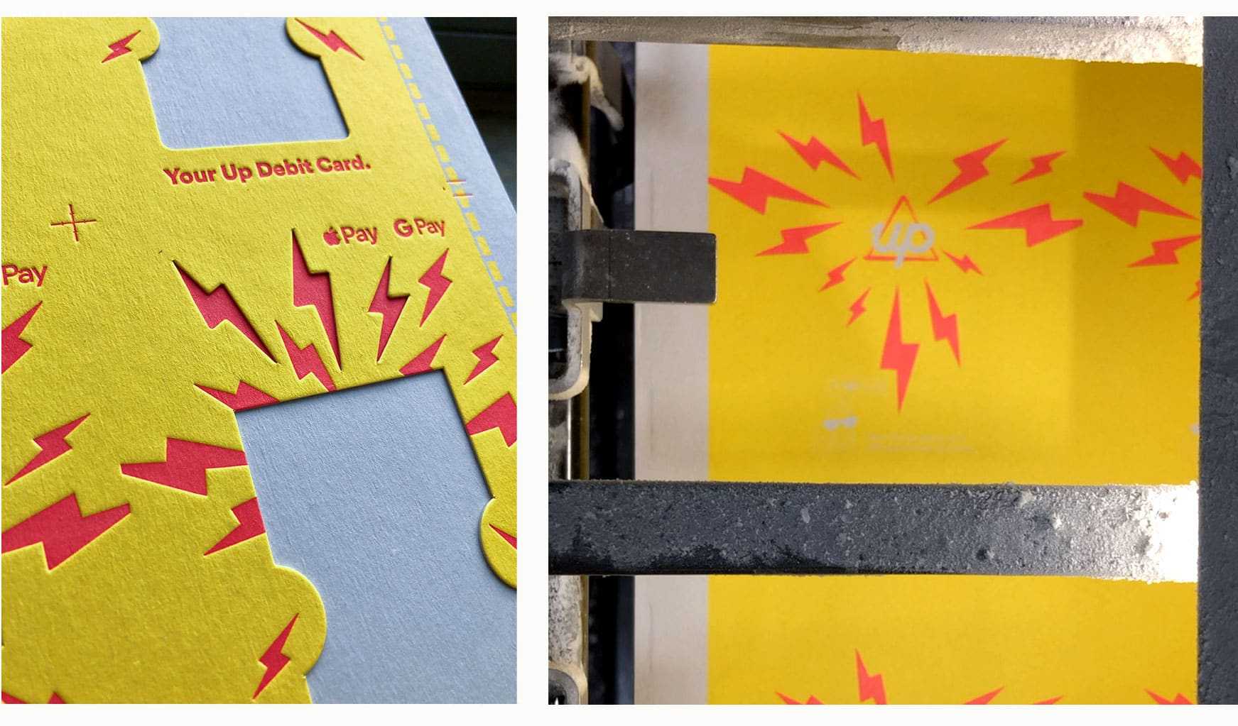
Making something this complex is a non-trivial piece of work, lucky for us, our printing partners Taylor’d Press are always up for a challenge. Many discussions with James (Founder, Taylor’d Press) started with some awkwardly long silences and anxious giggling but always ended with; “Pete, we can do it, we just need to figure out how”. Many design iterations followed and we were able to land on a design that could actually be printed and might just melt some faces.
Improving sustainability
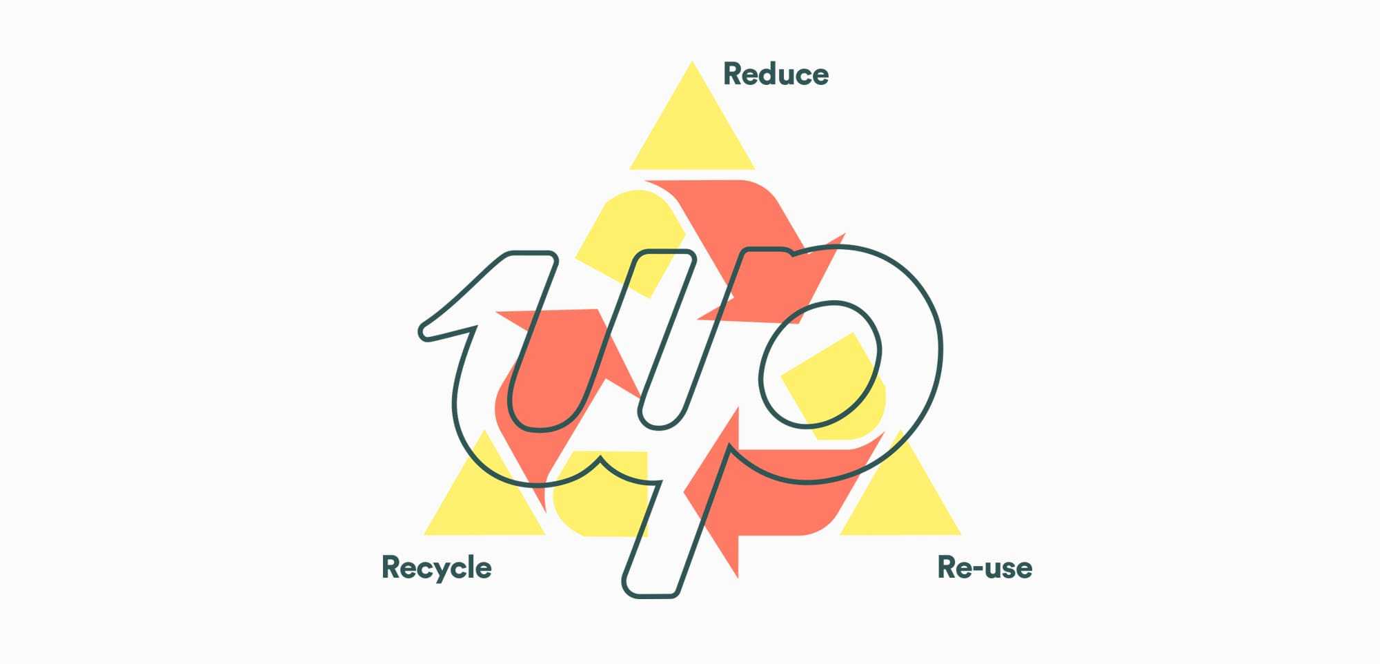
Thanks to our continued growth, we’ve seen the volume of Welcome Packs we produce steadily increase, it’s important now more than ever that they’re produced as sustainably as possible. To make this happen, we incorporated the simple and timeless message of ‘Reduce, Reuse & Recycle’ into our design process.
Reduce
One advantage of being a ‘digital’ bank is that we have an extremely light physical footprint compared to legacy banks - we have no branch network with heating and cooling requirements and very little physical paperwork. It is part of our DNA to try and use less’. A major update between iterations is the reduced the size of the pack from a traditional DL mailer to a custom A5 package. This one change has meant that we’ve been able to reduce the amount of paper we’ve used by 27% - stoked!
Reuse
Rather than creating a single-use and discardable item, we decided to bake in a design concept that would give people a fresh way to interact with their money while also having a positive impact on their finances - we decided to turn the back of the mailer into a 52 week savings challenge. The ultimate one player Savings game where you are the winner every time!
While the 52 week savings challenge is not a new concept, it’s a classic for a reason. We’d seen lots of people making their own version to track savings, so we thought we’d give it the Up treatment to make it useful and easy on the eyes. The unexpected simplicity is what we really dig about the Save Up Card, and who couldn't do with an extra $1,000!? The idea for the ’Save Up Card’ was born.
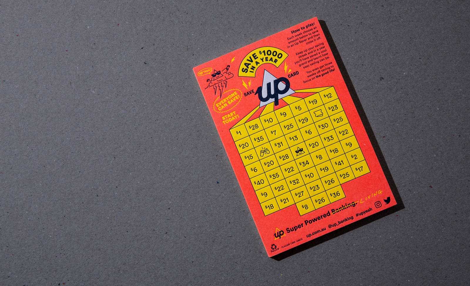
The design had to be fun and engaging, otherwise it would seem just like another onerous spreadsheet or tracking tool. Like the love and attention we spend inside the Up app, if we can make saving look and feel fun we can encourage better financial habits and help our customers get what they want in life.
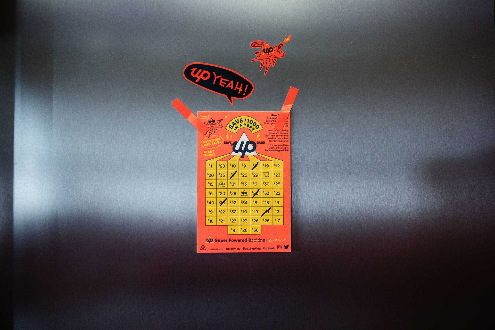
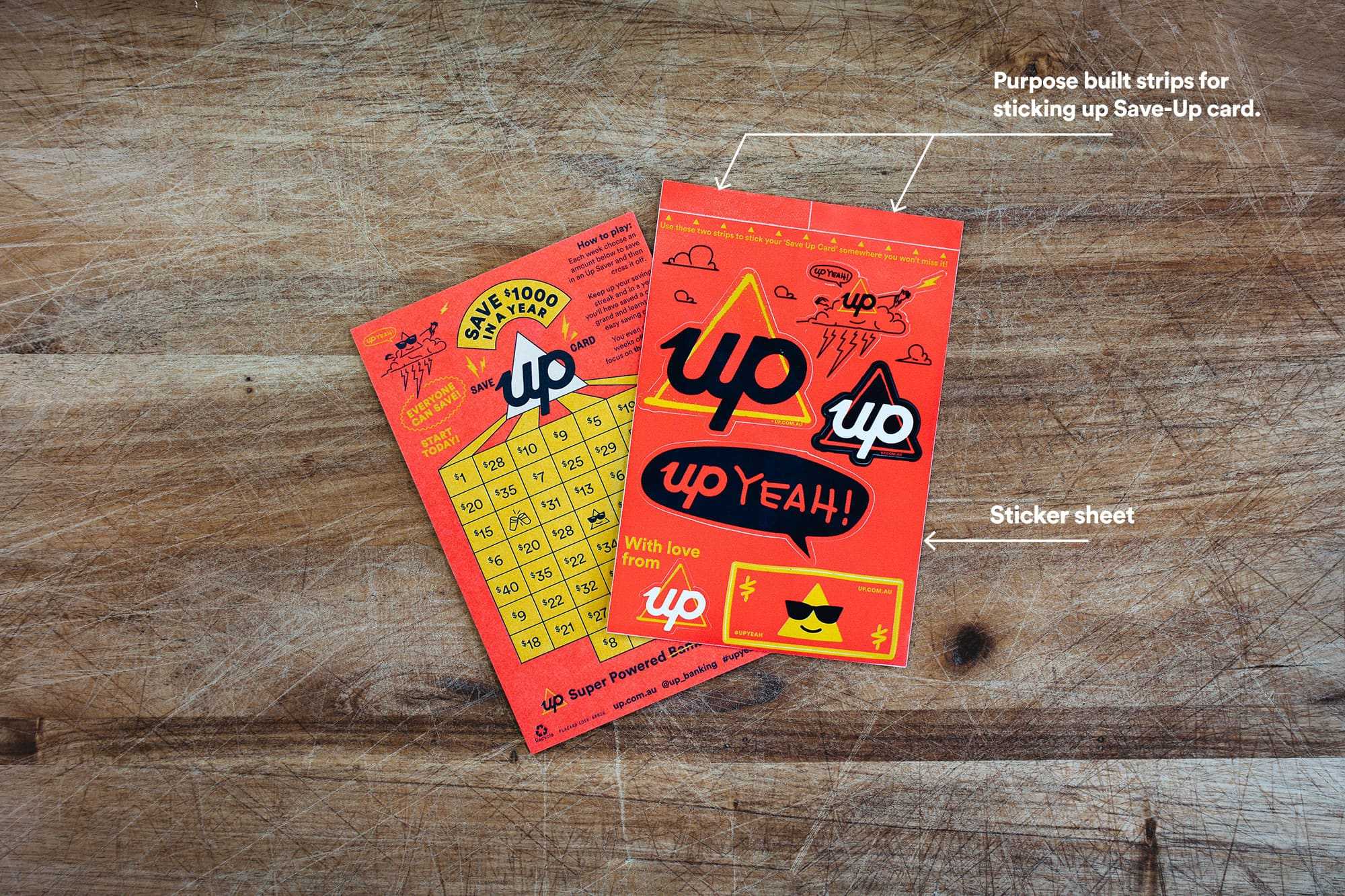
To use the Save Up Card, Upsiders simply stick it on their fridge or somewhere else handy (using the stickers from the sticker sheet included in the welcome pack) and start marking off amounts each week they’ve saved into their Up Savers which earn great interest. We’ve also given Upsiders a few weeks off for good behaviour (or indulgences).
Recycle
Both the mailer and the envelopes we send them in are made from recyclable paper stock, so once you’ve saved $1,000 you can also save some trees by disposing responsibly. We have a strong desire to keep improving though and are currently working on ways to improve in future iterations.
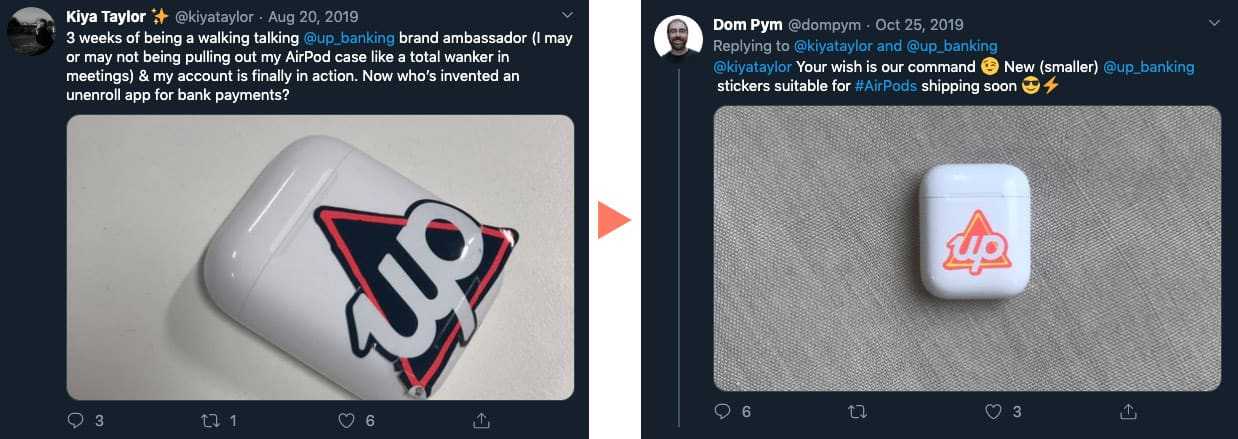
Customer Co-lab
We love hearing from our customers about ideas they have to improve Up, it's a huge part of our decision making and roadmap. When a customer reached out with a request to have a slightly smaller Up logo sticker to fit their life better, we listened…
Debit Card
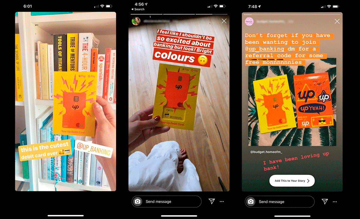
It is safe to say, that to-date, the response to Up debit cards has been super positive and are a real talking point. We’ve heard reports of random strangers bonding at a bar when they’ve noticed their Up cards whip over the counter. A real match maker.
From a design perspective, it’s really nice to get ongoing, positive feedback on your work - especially when you take a risk and try to shake things up a bit. We love hearing your stories about how your Up cards are a real conversation starter wherever you go.
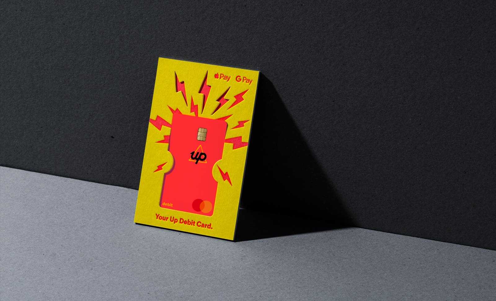
All the positive feedback has driven us to push even harder for this iteration. How could we make a nice card nicer?…or a bright card brighter?! Essentially, how could we create more a card with more face melt?
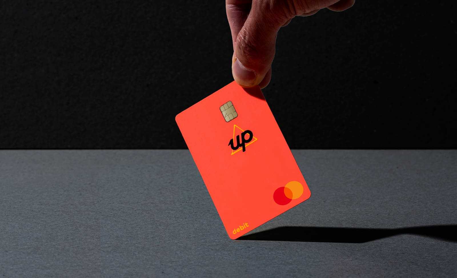
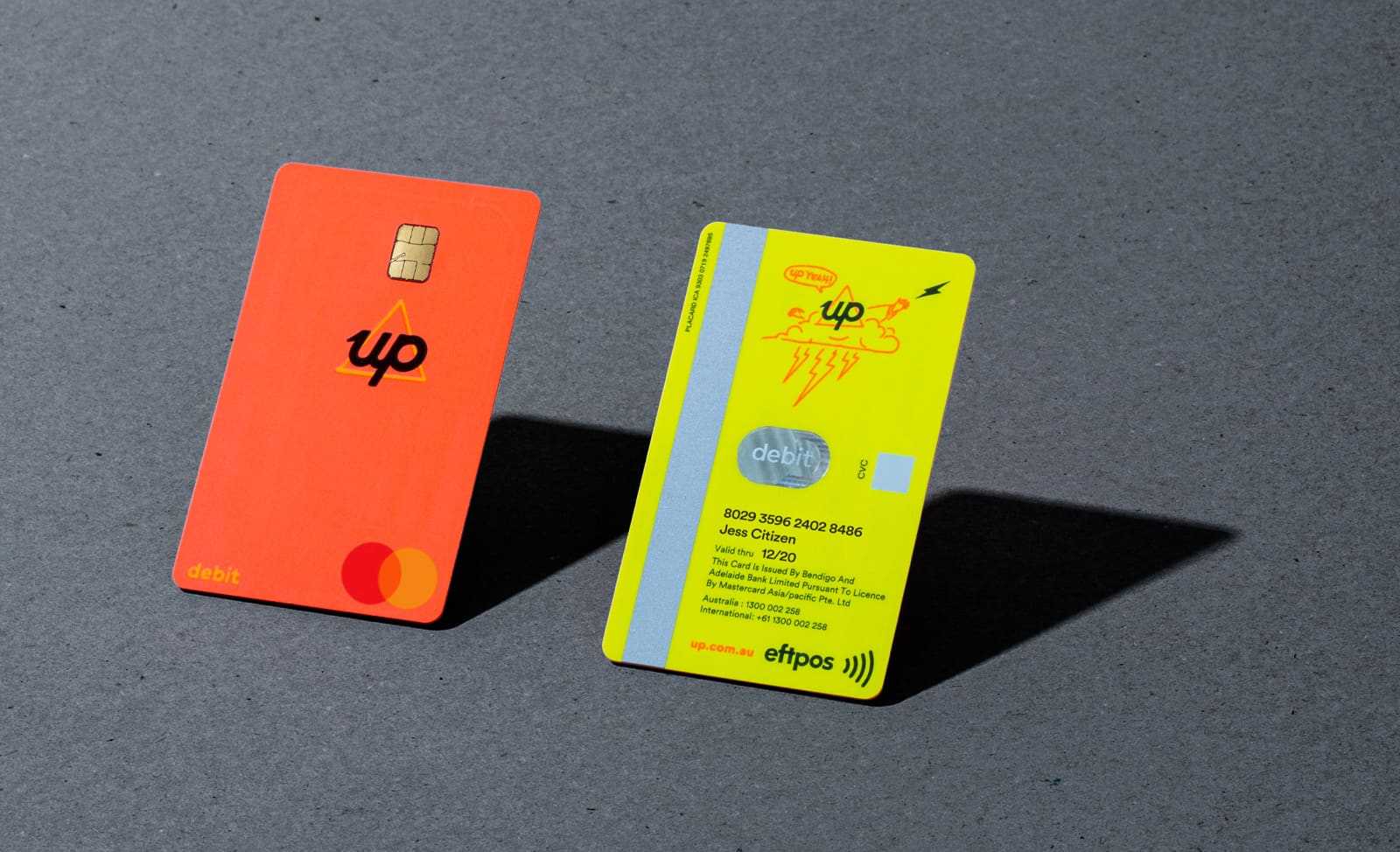
The colour of our debit card is informed by our vibrant brand colours - given we are a digital product, our colours are optimised for screen, not print. Our brand is designed to be served animated and electric. Translating this digital vibrancy into the static world of plastics, Pantone and chips is definitely a challenge.
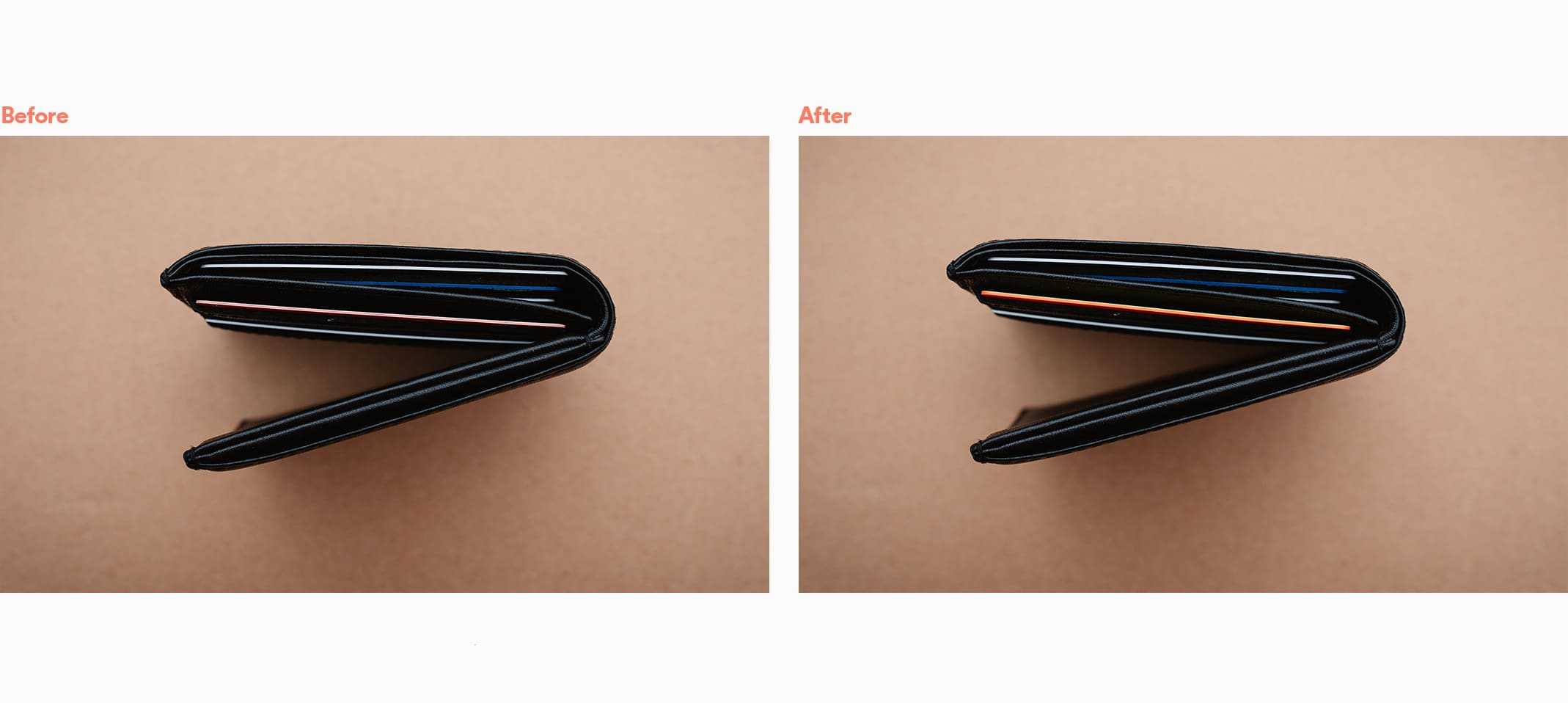
Card Core
We’ve always been relatively happy with how the front of our cards looked, but we weren’t happy with how the card looked in profile - in your wallet or purse - we wanted more pop! It might seem like a minor detail - but this is the kind of thing we really nerd out over. We felt the core was letting us down when compared to the front of the cards, so we got our magnifying glass out and went to our card manufacturer Placard with our challenge.
As it turns out, there are many layers that go into making a debit card - antennas and laminates can muddy the water. Unlike when specifying an ink colour using a Pantone colour, the plastics that make up the core of a card are not standard screen or print colours and so, with no formal way to reference desired brand colours, we armed ourselves with technical terms like ‘fluro’ and ‘face melt’, and asked Placard to find something that fitted this description!
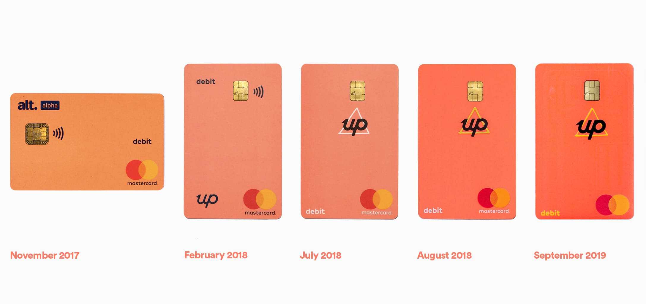
Card Back
For our first card, a lot of our focus had been on the design of the face of the card and striping it of personal details along with moving to a portrait orientation - this was a first in 2018 and has since become the norm for neo banks.
Now it was time to tidy up the rear 🍑
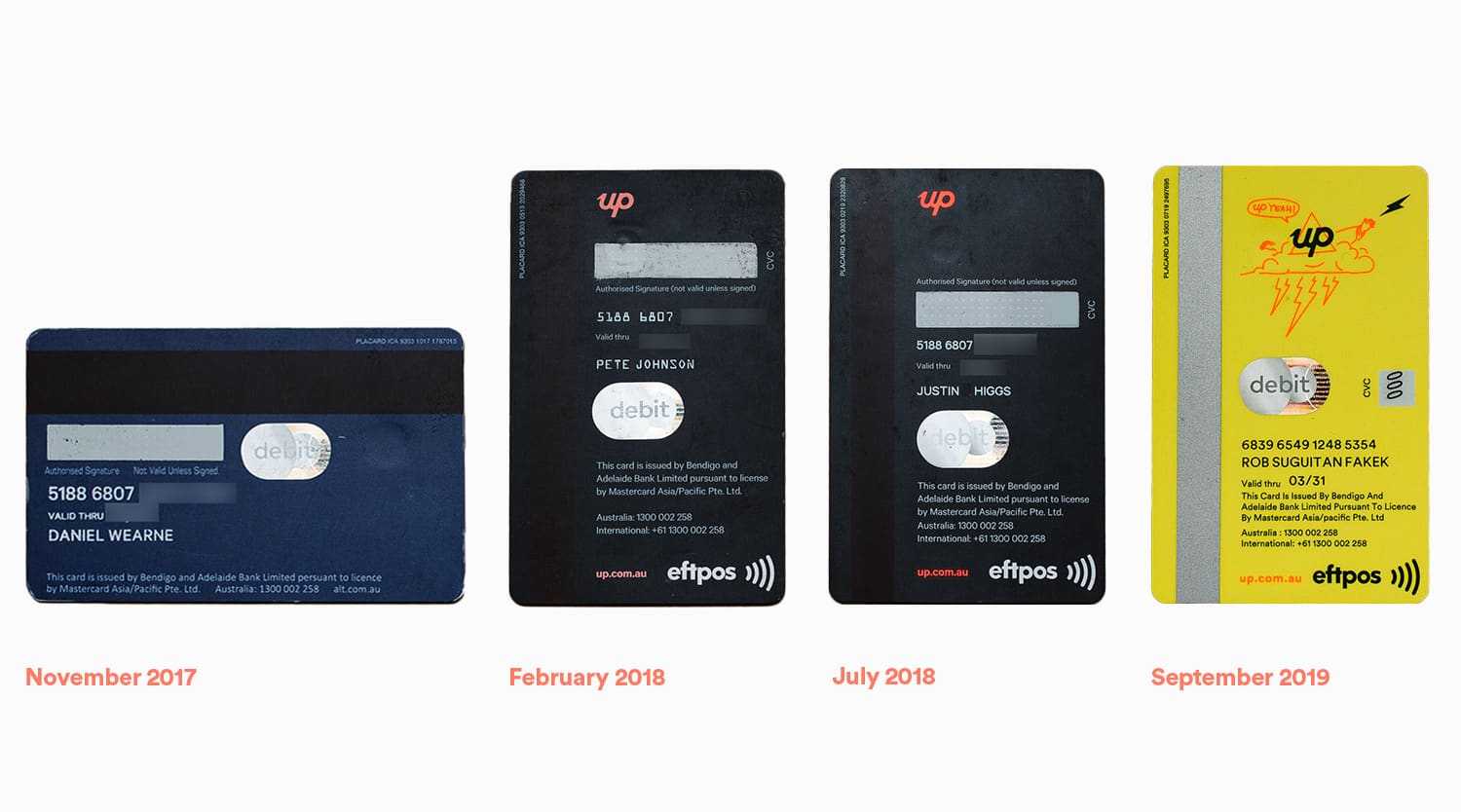
The Midnight Blue back was originally chosen to match the app, but given the success of the front colour (sunset red), sunrise yellow seemed truer to the Up vibe. Plus for some it’s easier to read - win win. When we received the sunrise/sunset combination samples, we all agreed the combination felt more Up/lively and less banky.
In our ongoing push to strip off unnecessary clutter and leave behind legacy banking formalities, we removed the signature panel and replaced it with an illustration of the Up Tech Lord - our cloud based spirit, chanting our internal mantra of ‘Up Yeah’. We probably need another post explaining the range of curious illustrations and designs you’ll find throughout the Up app - coming soon...
We’re super stoked with the latest iteration of our cards, envelopes and mailers and proud that we’ve been able to make them more sustainable while also more excellent.
The best bit is that our customers love them - from the moment they started hitting people’s inboxes, they’ve been shared on social media. Unexpectedly, we had to do a separate print run of the Save Up card because more than 800 customers reached out to us to see if they could get one. You can download yours here in black and white or colour. If you’re a customer who’d like one mailed out, hit us up in the app using Talk To Us and we’ll hook you up.
There is still some gas left in this tank - we are not done yet. Keep an eye out for the next iteration coming soon.
The best thing is that we’re not even sure how long this iteration will be around for. We’re already working on the next one 😉

Tags: Welcome Pack, Design, Sustainability, Recycling
Get the gist
We’ll swing our monthly newsletter and release notes your way.
