

Designing a Super Powered Welcome Experience
For a branchless digital bank, the tangible moments you have with your customers are few and far between. We knew we had to think outside the square but inside a budget to delight our new Upsiders. A common mantra across the new wave of 'neo' banks is to break free from the conservative mindset that has allowed banking to grow stale. The standard card delivery experience from existing banks is strong evidence for this mindset.
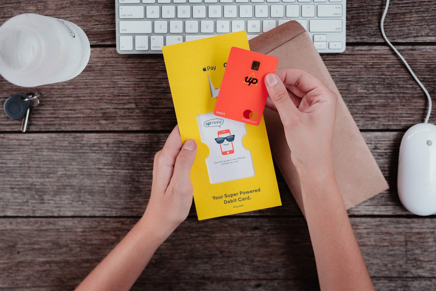
With all the new 'Pays' from Apple, Google and others, it's easy to think of the humble bank card in your wallet as a dying relic that must certainly be on the way out, however this underestimates the importance of backwards compatibility in banking. There are situations where you still need to tap, swipe or insert a card and, although virtual cards are the future, plastic is still king. We relished the opportunity to design our debit card and welcome pack from scratch, and to demonstrate that our forward thinking isn't exclusive to digital experiences.
Joining Up
One of the first features we built for our app was the sign-up flow. We were very clear on our goal from the kick-off meeting:
"Allow users to download, install the app, and have a bank account in under 5 minutes."
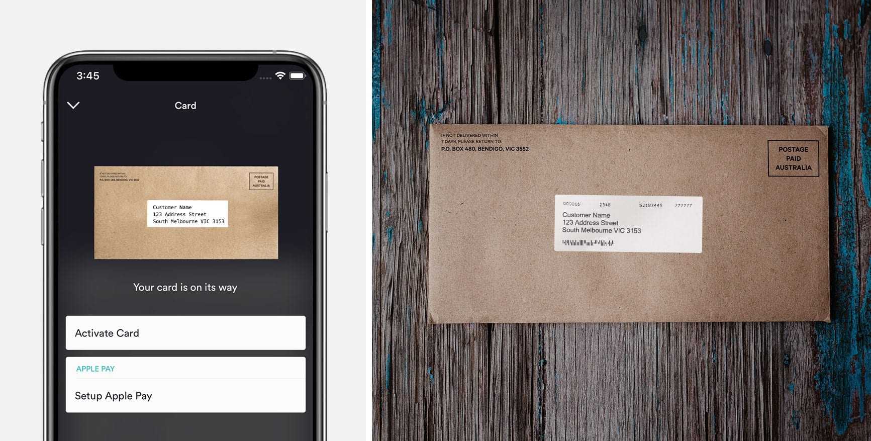
The most substantial part of this was always going to be identity verification, but over several iterations, we were able to blitz our original goal and create a sign up journey that takes, on average, under 3 minutes (2 minutes and 11 seconds to be exact). The cherry on top was that we were able to instantly provision Apple Pay for iOS users on completion of the flow, giving our new customers everything they needed to start banking with Up in minutes. Once they'd finished signing up, we then let customers know that their welcome pack was on its way.
So far this was in our wheelhouse; a software solution packaged neatly inside a mobile app. But from our new customer's perspective, they were just about to have their first tangible Up banking moment: the arrival of their debit card. As keen enthusiasts in the FinTech space, we were aware of what others had done prior (See Simple Monzo Square Cash. We were eager to push things even further.
The Status Quo
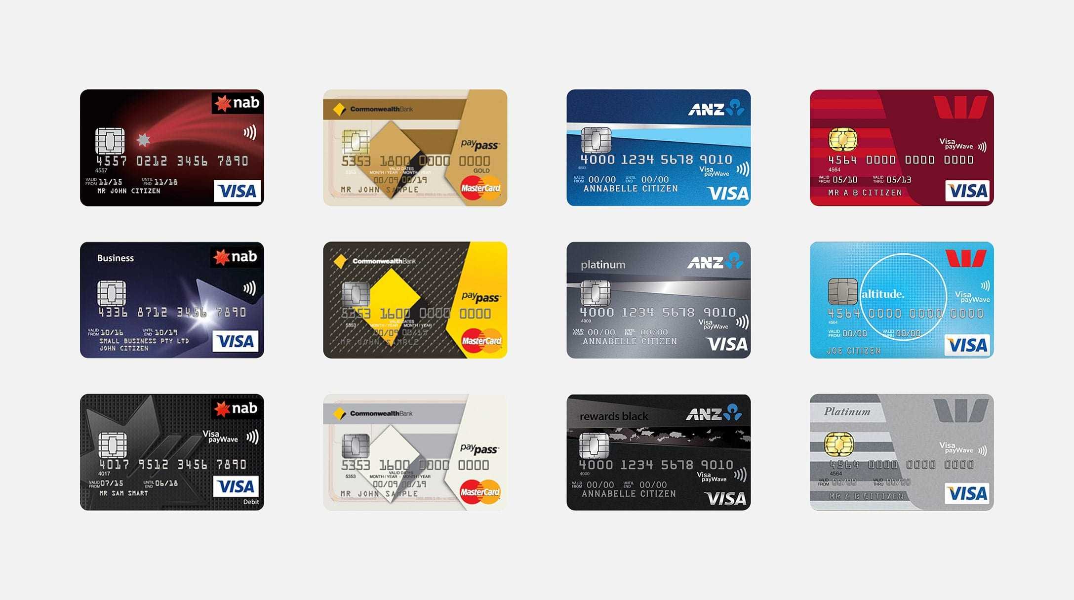
Early in the process, we visited our card production facility which specialises in pretty much any PVC card that's in your wallet (bank cards, driver licenses, vouchers etc.). We were given a tour of two factories adjacent to each other—one that produces "blanks" in huge runs for storage, and another that customises the blanks (with customer details) and mails them out in smaller batches daily. We asked lots of questions about each step in the process and also the costs of trying things off the beaten path. It became apparent that everything was optimised and streamlined to produce the most cost-efficient result, which looks something like this:
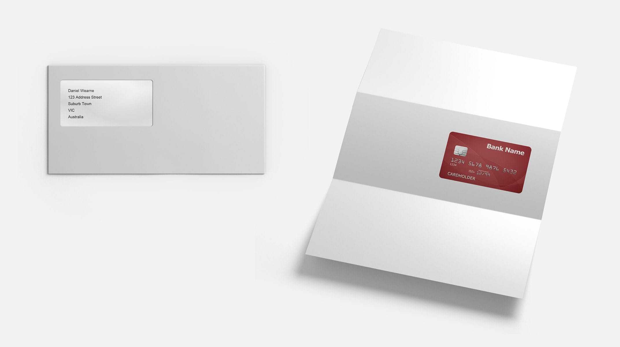
A bank card glued to an A4 sheet of paper folded twice, with the customer's details positioned for the window of a plain white envelope. Often the card would have an ugly sticker with activation instructions. The same letter template is used for the PIN that is mailed a day or two later to the same address. We knew we could come up with slicker solutions within our app for card activation and setting the PIN, but even with these things aside, we never really entertained the idea of following the standard experience.
Our Vision (The Sharing Strategy)
We knew whatever we wanted to do that it would be different and therefore come at a higher cost. A large part of justifying the expense was convincing everyone involved that the spend was worth the benefit. What we'd seen with digital banks overseas was that in this social media age, people love sharing great design. This is a very underrated marketing tactic that scales incredibly and has social proof baked in. This became one of our core objectives:
make something people would love to show others.
When we initially presented our ideas, there was some resistance. Some were certainly concerned about any increase in cost. "Wouldn't new customers prefer those extra few bucks in their account?" While this isn't a bad point, we always believed that making a good impression early sends a great message around our attention to detail. The black foiled box your new customised Nikes arrive in. The intricate wrapping and presentation of an Apple product. Why shouldn't your very first physical experience with a new digital bank be in the same conversation? This was definitely a contrarian approach to adopt in an industry that has demonstrated it's all about driving the cost down at every opportunity.
An Up Card. Literally.
Without trying to throw shade, exploring the bank cards landscape left us with an after-taste of convolution and weak branding. We love simplicity and are firm believers in Dieter Rams' "as little design as possible" ethos. Our creativity was flexed mostly through the form factor of the card, and the things we were able to remove and reduce. One of the earliest directions we steered towards came from our branding designer Hannah, who stumbled across the idea of doing something portrait-oriented. We liked that it was a more natural way of holding the card, especially when using contactless payment, and it was consistent with our name back then; Alt - short for 'alternative'. Serendipitously the connection became even stronger when we became 'Up'.
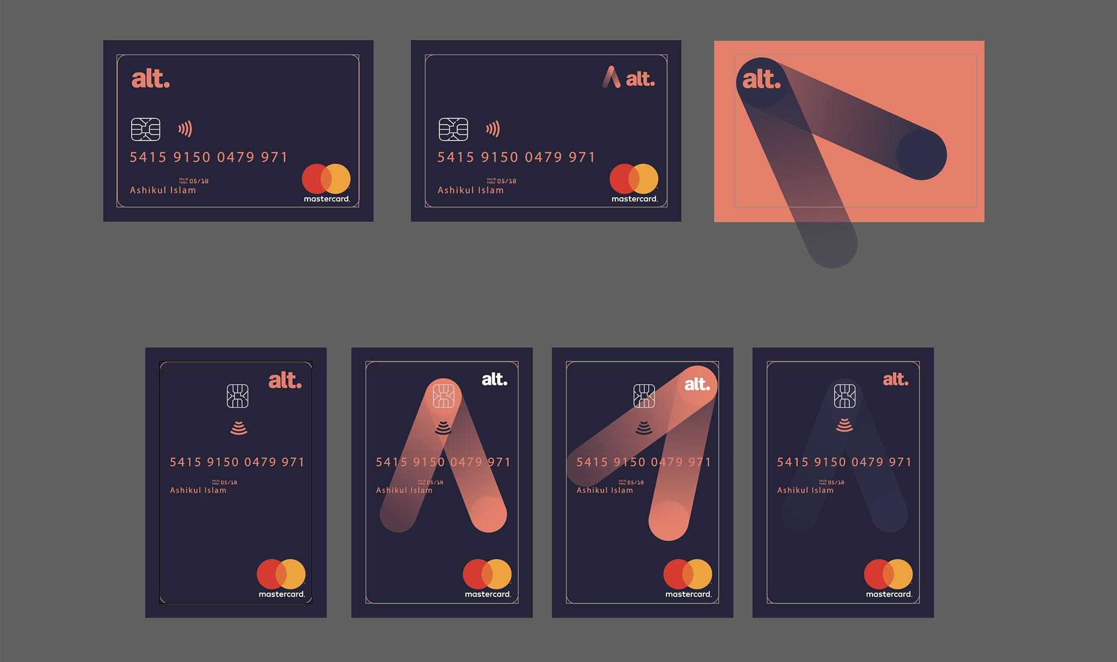
This was around August 2017, and we were determined to find out if anyone had pulled off a vertical card while adhering to the exacting Mastercard® Design Standards. We found two examples back then (a General Motors Customer Card, and a Penfed Credit Union Card) that had vertical artwork on the front of the card, but resorted to a landscape layout on the back.
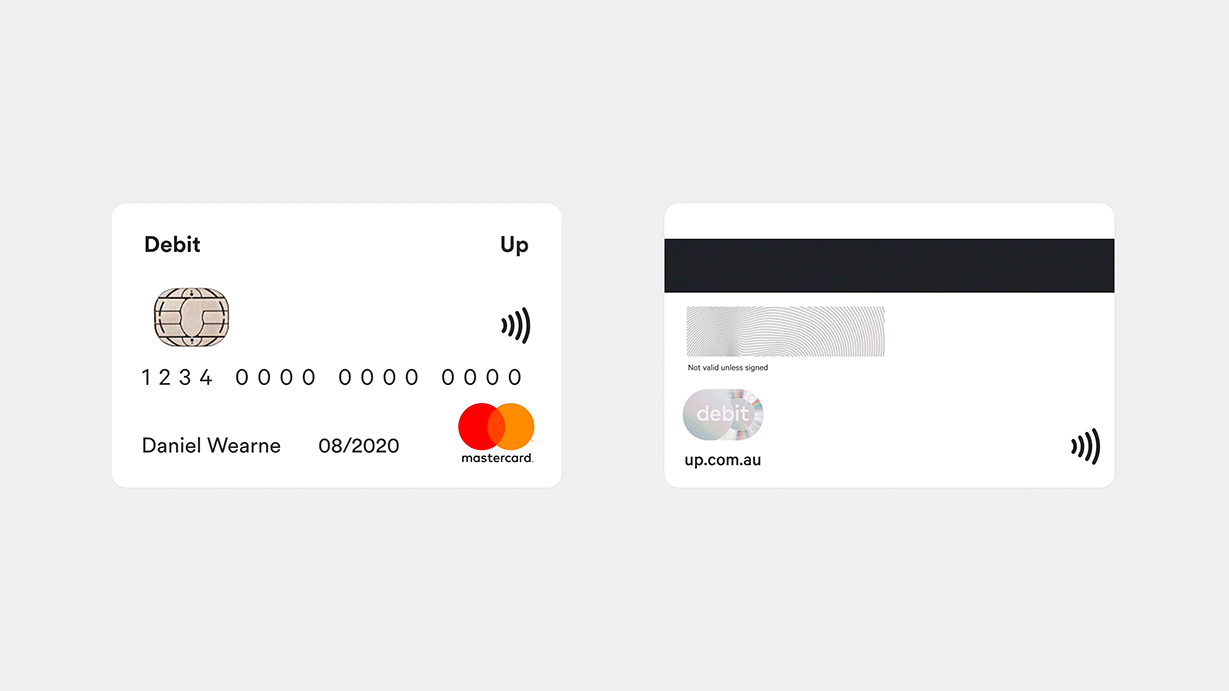
We wanted the entire card to be truly vertical. Part of this ambition was to abandon the embossed numbers on the front (PAN, expiry and cardholder name) as the punch-machine wouldn't rotate that way. An implication of this was dropping support for those old flatbed imprinters, but there was a significant benefit of moving sensitive information to the back of the card, making it much more shareable. Other notable design decisions included ditching unused tracks on the magnetic strip (making it thinner) and getting our supplier to use the smaller nano-SIMs for the first time.
It's worth noting that it took several versions to achieve a lot of these changes. We would wait for approval or rejection from Mastercard each time we submitted new artwork, iterating towards our end vision. "This time we get the SIM!" "Next run we'll get the core colour." We could tell by the lengthy response times that no one else was pushing the rules like this. Almost a year later we've seen dozens of bank cards around the world move in this direction so we must've started a trend.

Pushing the Envelope
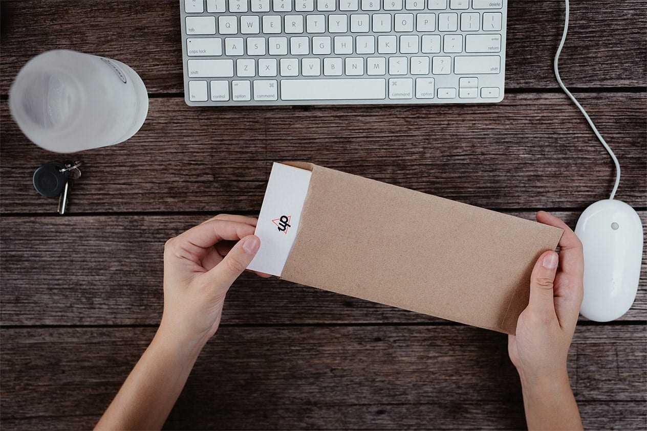
We spent many hours foraging on Pinterest for various examples of print and packaging design, which turned up everything from architecture pamphlets to bottle labels for poached pears. We were excited by the range we had to play with regarding textures, stocks and finish. For the carrier, we decided to go with something letter-pressed pretty early in the process. We loved the way it felt in hand.
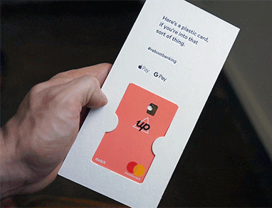
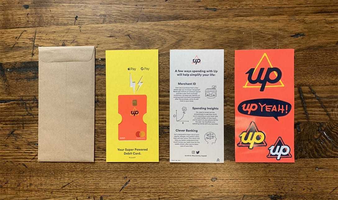
We also had some smaller objectives we wanted to hit. How could we introduce and emphasise the card's vertical orientation? How could we keep the debit card in place without glue? It seemed that 'til this point, we had challenged nearly every standard. However, in the end, we decided to go with a DL (Dimension Lengthwise; the most common size for letters and flyers) sized carrier. If we wanted the customer to pull the carrier out vertically, we'd have to make our own 'pocket' (flap on the short side) envelopes instead of using the more readily available 'wallet' (flap on the long side) envelopes. We worked with the lovely crew at Paperpoint to build and print envelopes from scratch with beautiful 80gsm Buffalo Kraft paper.
Losing the Glue
Something that irked us about nearly every bank card we had ever received was the way it was fixed in place, with a ball of glue. It felt a bit gross, sometimes ripped the paper, left a residue on the card, and just seemed inelegant. Recently I'd seen a Virgin Velocity Frequent Flyer pack that made use of tidy die-cuts into the cardboard. We knew we could achieve something affordable and functional, sans glue.
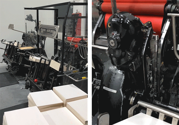
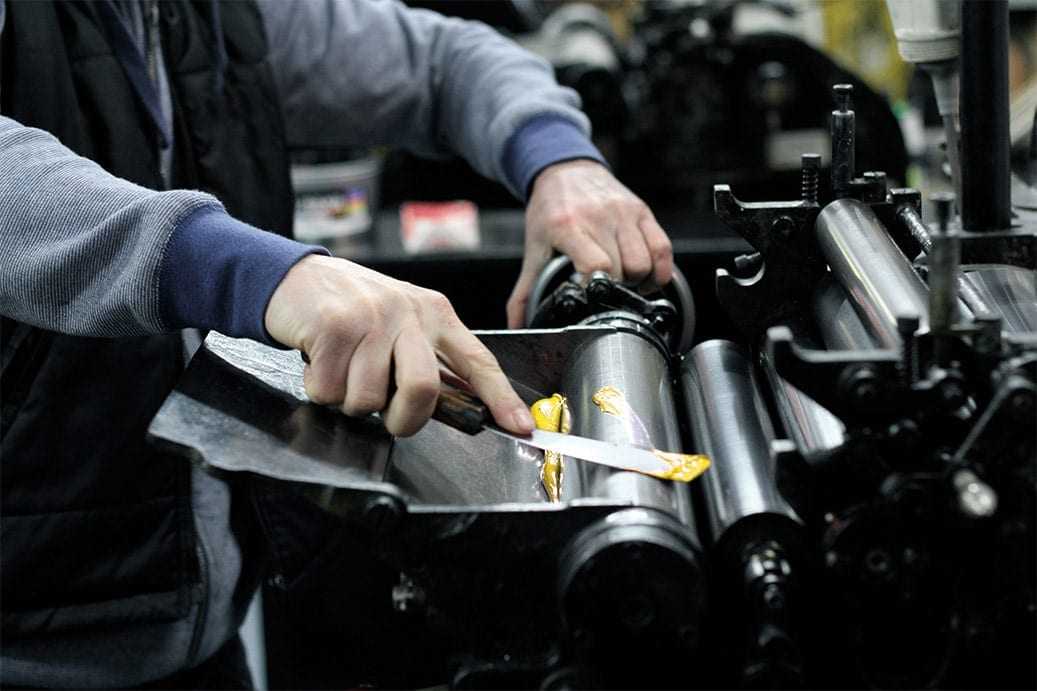
We have a long-running relationship with James and Kirsten from Taylor'd Press (6 years and counting) and sought them out to learn all the constraints in regards to letterpressing and duplexing (sticking card together to make thick stock). Armed with their industry experience and advice, I pulled out an X-acto knife and began prototyping some DL carriers.
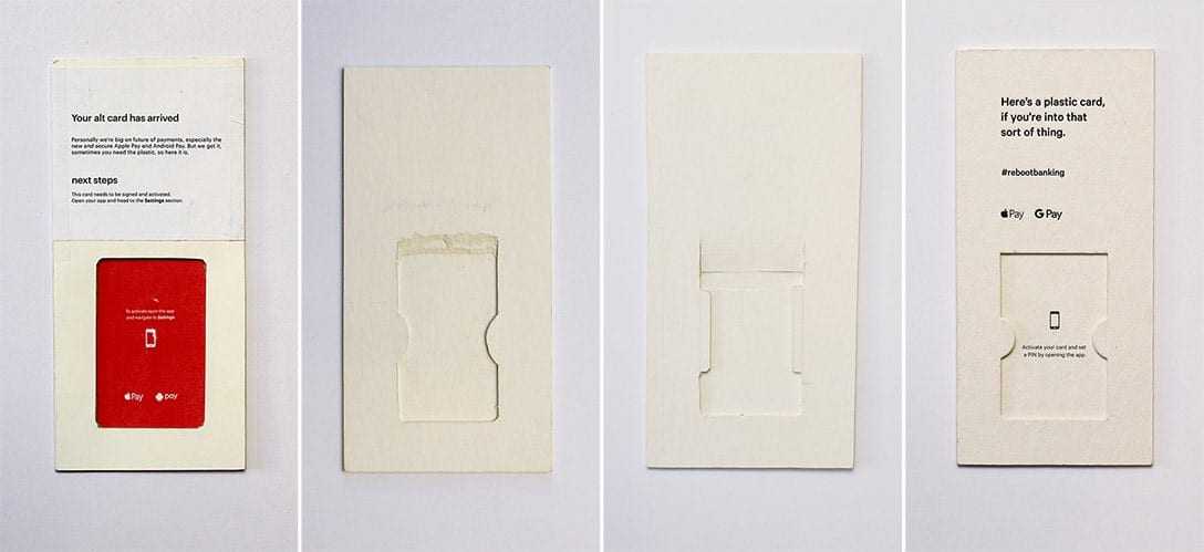
Cutting a perfect debit card shape out of the carrier meant the card would sit flush, but would also be difficult to retrieve. We knew that people would bend the entire carrier to get their card out. Andi, another Up designer and resident woodworking hobbyist, suggested we chamfer the top layer to offset a little lip, allowing a small ramp to slide the card. We added some 'half-moons' to the sides, and it worked perfectly. In the end, we devised a carrier that was made of 3 layers of beer coaster stock. It was thick enough to feel tactile and soft enough to take a decent impression from a Heidelberg letterpress machine.
The carrier design only had one minor flaw— sometimes it would crease across the middle once in transit (perhaps weakened by pressure from the rollers or sorting machines). We noticed this in a few tweets and eventually saw it ourselves, so we fed this information back to James, and he was able to rotate the stock so that the grain would run vertically instead of horizontally, strengthening the carriers. One of many tweaks throughout the journey.
Once the design had been settled, James had a big headache on his hands; he had to work out a pragmatic way to print, glue, cut and assemble these carriers at scale. He's since had several runs to nail the process, and it's now safe to say he no longer screens my calls when we need to re-order.
Our Economies of Scale
The budget we gave ourselves was around 60% over the cost of the traditional stock 'trifold' experience mentioned earlier. It's easy to assume that reducing costs is all about reducing quality or running larger quantities. We found the greatest savings were made by working more closely with our suppliers to identify the big inefficiencies in the process; areas where we could trim the fat without compromising on the end result. Printing on the envelopes before they were cut and glued to prevent double handling, or increasing the amount of carriers that were glued together before cutting them down to reduce assembly time. These were a couple of the solutions that reduced costs significantly. After a few big runs we were dialling things in so well that we created enough room in the budget to include an Up sticker sheet.
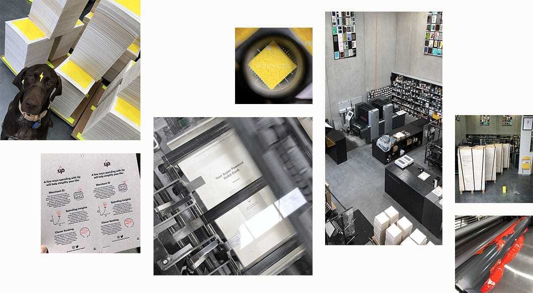
Over the year and about 5 print runs (each run at least double the previous in quantity), we were able to get the cost down to within 7% of the standard traditional banking pack. All while including more for our customers, and without compromising on the design, function or print quality. Keeping the costs lean isn't the most appealing part of print and package design, but the creativity here from us and our printers is what allowed this entire endeavour to be sustainable.
As Dom mentioned in our last post, since we started working with Pete and his crew at CIP Studio, our brand and messaging have been elevated to another level. The latest treatment of the welcome pack really conveys the playfulness of the brand and has been a massive hit with customers.
The Reception
There's no denying that Up will always predominantly be a digital banking experience. We refer to Up as tech-led banking, not banking-led tech. It's what allows us to adapt to new challenges as quickly as they arise. While print projects are much less forgiving when it comes to oversights, and burn at a slower pace (often months between concept and end-product) the feeling of holding something in your hand instead of looking at it on a screen has its own unique rewards.
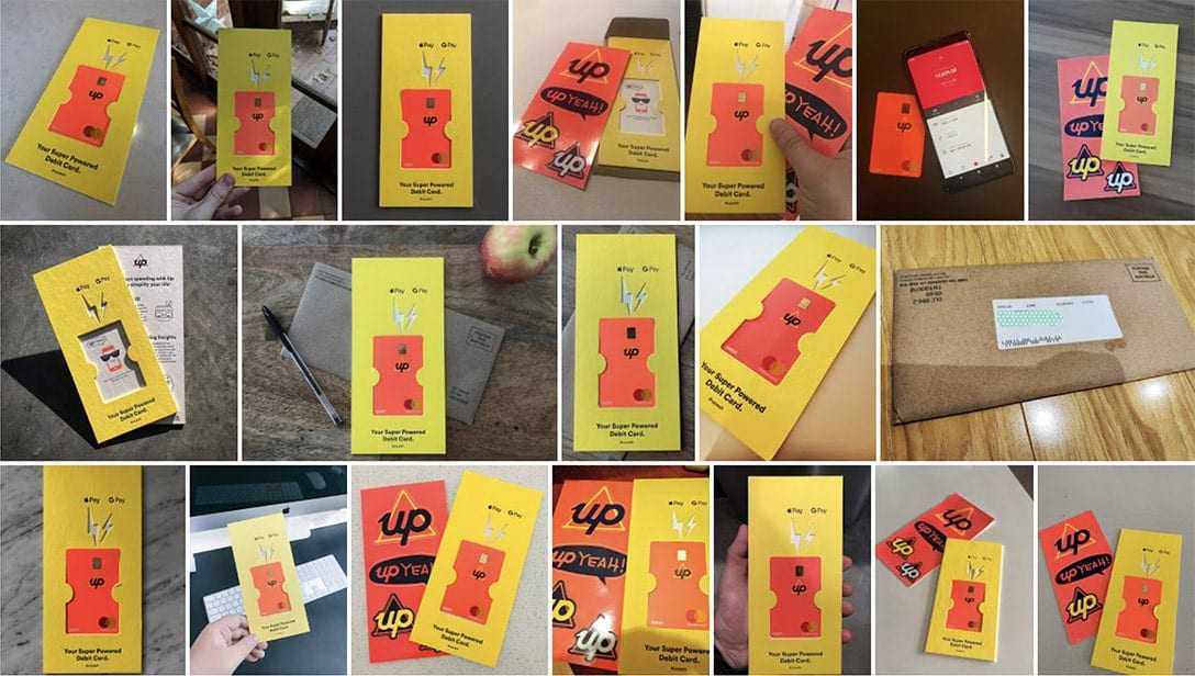
As tweets and 'grams continue to come in, we are so excited that people are receptive to our passion and taste. With our user base growing every day, and with each iteration of tweaks, the amount of social sharing is surpassing even our lofty goals. If you haven't had the pleasure of receiving an Up welcome pack - sign up now. It's free and easy to try. Just don't forget to tag #upyeah

Tags: Welcome Pack, Onboarding, Design
Get the gist
We’ll swing our monthly newsletter and release notes your way.
Top 10 highlights from 2018
Happy New Year! While 2019 has just begun and there are so many awesome things planned for Up this year, I just thought it’d be cool to look back at a few highlights from 2018.

Dom Pym
Continuous delivery at Up
Deploying change to production is the heartbeat of any modern tech company. Not so much for most banks, where sometimes it is only done a few times per year. At Up we do it several times per day!

Chris Aitchison