Designing Super Powered Events
Jan 23, 2020 · Building Up
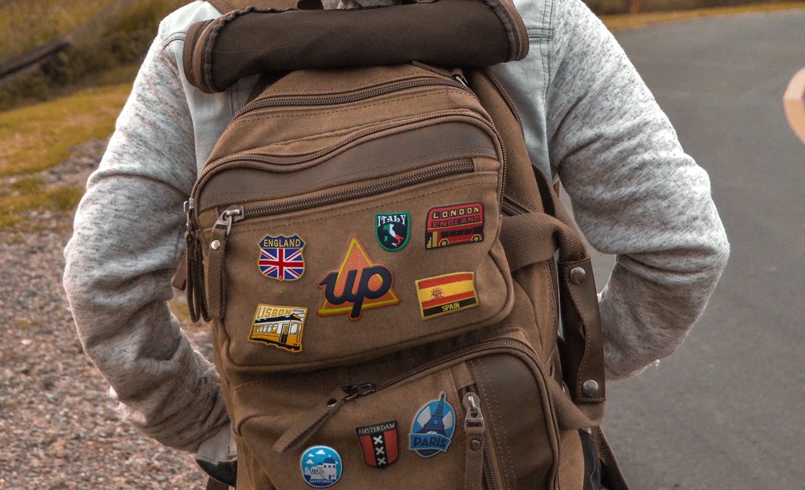
Events provide a challenge for a team as they offer a rare chance to create a fully immersive customer experience. As Australia's first purely digital bank, events are a chance to translate the digital Up brand and bring it to life in the real world.
From the beginning, we’ve wanted Up events to stand out. A pull-up-banner simply wouldn’t suffice, so the challenge in front of us was to:
Translate the Up brand into the physical world and give people a positive and meaningful experience.
Early on, events helped us to find our creative feet and figure out just what creating our “Upness” really meant. They forced us to bring a predominantly digital brand into the real world and this made them really valuable.
For a company that works predominantly in the digital realm, events let us connect face-to-face with our customers. We’ve never hired event staff, so customers would get to meet the engineers and designers who are actually on the tools day-to-day building Up. This has created a lot of love and many advocates. It also means that any feedback heard by Upsiders at events is delivered right to the source and is often pushed right back into the product.
Unexpectedly for a digital brand, events offer us a platform for experimentation. They encourage us to push our brand into new areas, take risks, and progress some weird yet wonderful visuals to new places.
At Up we talk a lot about iterating and being agile (see our thoughts on continuous delivery). This approach has translated well into the way we design events. Each event has been unique and had different ambitions, audiences and spaces to design. Our approach has evolved dramatically throughout the year and we’ve pushed ourselves to deliver a better experience each time. This has included looking for smarter ways to integrate our product and finding new ways to connect with people who haven’t heard about us yet.
Below are some of our favourite events and moments so far. In most cases, the final experience actually came out close to how we planned! 😮
Up Launch (Oct 2018)
The mission
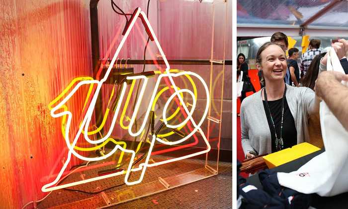
The objective of our first event - our launch - was to announce to the world that Up was live to the public. Our Melbourne launch was held at Notel and was particularly unique in that it was held inside and around 6 Airstreams parked on top of a converted Melbourne carpark. No big deal.
A unique setup
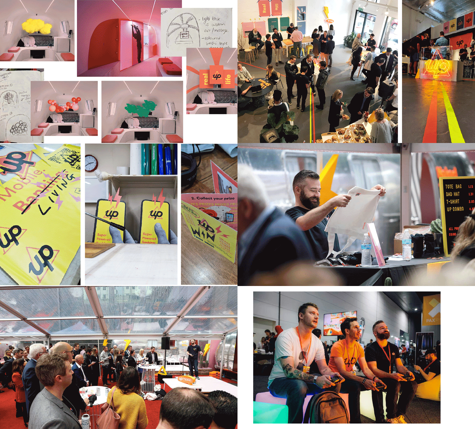
To make the most of the unique space we had available to us, we wanted to lead guests through a tour of the product by stepping them between the airstreams. Each airstream showcased a different “superpower”.
As they moved between caravans, guests would meet Upsiders, watch live demos, or use their newly opened Up accounts to purchase merchandise, food and drinks.
What we learnt
From an events perspective we learnt, firstly, that designing for curved roofs is hard 💯 as there is limited flat areas to attach materials. Secondly, large outdoor spaces tend to be exposed to the elements, so having wet weather plans is essential. We also learnt that the weight, structure and types of attachments you use to fix artwork to surfaces is really important to have mapped out - you want things to stick, but also to be sure you won’t damage expensive finishes.
The biggest take away from our launch though was that events are FUN! At first not everyone in the team could see themselves talking face to face with customers, but when you put a whole lot of effort into producing an event, and are super proud of what you’re showing-off, it creates a real buzz that everyone rallies behind.
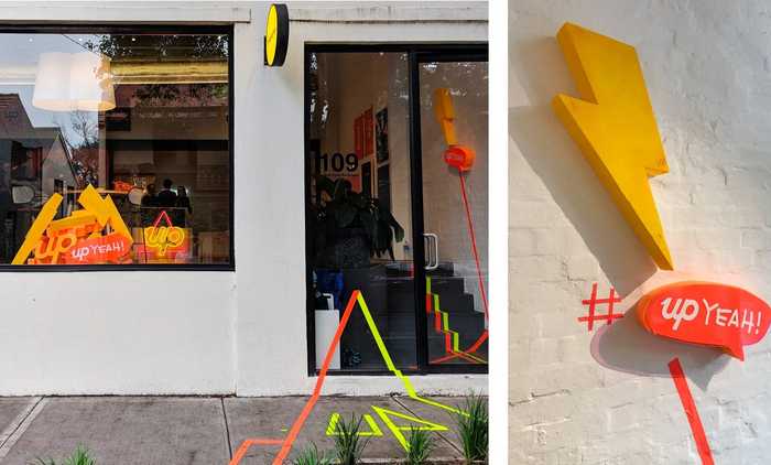
Want more photos of the Up launch? There’s plenty on Facebook here.
PAX (October 2018)
At Up we take our Mario Kart pretty seriously and things can get a little heated. To resolve any cough disputes about race positioning, our Head of Technology, Mike, built a custom analytics leaderboard. “Kartalytics” tracks the position of players during the match and shows their ranking in real-time. It also stores an office leaderboard to determine, definitively, who is the best at Kart. You can read more about Kartalytics here.
When the opportunity came up to be a part of PAX 2018 - the biggest gaming convention in the Southern Hemisphere - we jumped at the chance and knew exactly what we wanted to do.
We knew there’d be fellow Mario Kart fans at PAX, so why not challenge people to race us, and, if they defeated our valiant champions, win a pre-funded Up account? This felt like a great way to be relevant to the attendees, but also a good chance to show Up to a tech-savvy group of people.
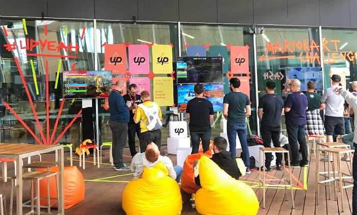
Activating Jeff’s shed (Melbourne Convention Centre)
With brand awareness and onboarding as our two main goals we set about designing two large spaces for the 3 day event.
Up isn’t afraid to be different and the assets we designed for PAX were minimal, lo-fi and directly contrasted to the headliners at PAX including Nintendo, Twitch and Alienware. We used bright posters, neon duct tape (super versatile) and some colourful TV displays to brand the spaces. As well as challenging Upsiders, we had staff available to chat and help customers join. At this event, we hadn’t quite cracked invite codes that could pay people a joining bonus, so we happily gave away free merch and badges.
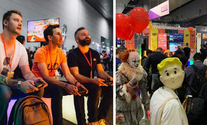
The best bits?
The highlight of PAX’18 was getting to rub shoulders with the Mario Kart World Champ 🎮. Fortunately for him we’d been playing Kart all weekend by the time he came around, so he won. We also got to talk to hundreds of curious gamers, which gave us lots of food for thought. The scale at which some of the other brands activated their spaces was also super inspiring. Maybe in a few years hey….
Pause Fest (Feb 2019)
Time to stop and think
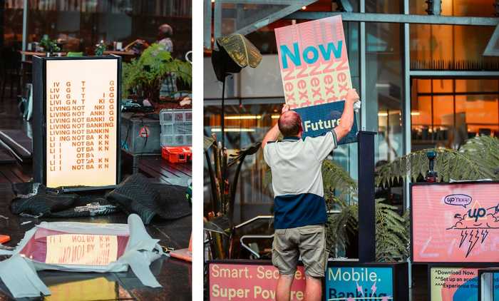
After designing and building a few disposable event activations from scratch, we decided to pivot our design approach for Pause. While each event had come with different constraints (like timeframes, budgets, and availability of people), we wanted to develop an approach to presenting Up physically that would be re-usable across events. This would ultimately be better from a sustainability perspective, but also allow us to invest in making the initial construction something we were really happy with.
A lightbox moment
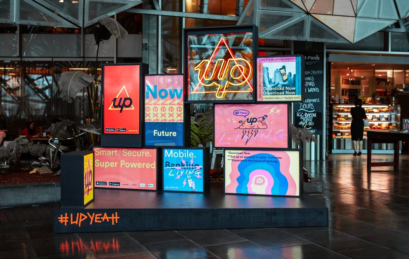
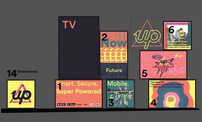
After lots of research, we landed on custom built lightboxes. Having quality frames made meant we could replace the graphics for each event and adapt to any space by stacking lightboxes in multiple configurations. The bright look and feel also fit well with our branding and let us intersperse our signature “Up” neon sign and TV’s, which could show rotating digital content and offers unique to each event.
Good things are always harder than you expect
While the concept for the lightboxes looked great, during the build phase we hit a number of unexpected challenges. Fed Square in Melbourne has very specific regulations for “built structures” like our lightboxes, so we needed to modify the build and materials to meet engineering certifications. As a result, a lot more hands-on installation than we expected was needed, and the lightbox frames were made thicker and rougher than we had planned. There was a lot of back and forth throughout, but ultimately, the final installation had the impact we were after. 😎
Put a pin in it
To compliment the bright backdrop, we also created custom enamel pins and a special promotional code people could use to sign up. Having something to give away was important as even though signing up for Up only takes minutes, we wanted to make sure people had something to remember us by if they needed to take something and run. Designing for a creative, design-savvy crowd, our goal here was to make something that felt a lot less like a standard promotional flyer and instead more useful and fun. We wanted something that wouldn’t just be chucked in the nearest bin and that we’d be happy to wear ourselves.
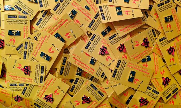
The enamel pins were mounted on quality letterpress card made from offcuts of our welcome packs. We gave away hundreds of the pins through the festival - there were two variants and we had people coming back to try and collect both.
University Orientation Days (March 2019)
For O-Week we wanted to connect with students and let them know about a smarter way to spend and save. Students attend O-Week to socialise, make new friends, learn more about life at Uni - and of course, grab some free stuff!
Activating across three universities and five campuses was no small feat for our tiny team. Our challenge was to create assets that would work across multiple locations to deliver a consistent (and fun) brand message and experience.
Because students LOVE merch and giveaways, this was the focal point of our O-Week design. It was important that our merch (Up tees, totes and hats) were designed and made with high quality materials. Our ethos is that all merch should be something you want to wear, and can wear again and again due to its high quality.
The O-Week designs were bright and lively, with strong visual backdrops so students could create and share insta-worthy content with their peers. At RMIT we were even able to bring in the lighboxes created for Pause to help bring the space to life, giving it our signature Up look.
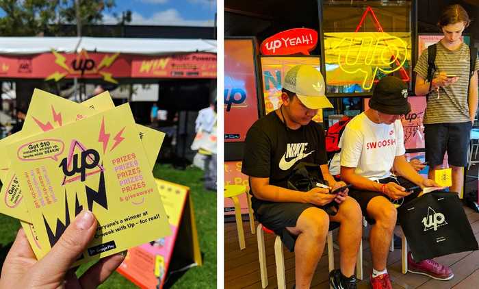
We had conversations with thousands of new students during a crazy, fun O-Week and over 1400 new signups. It was really rewarding being on the ground talking with new students about their journey, what was important to them about starting uni and Up, of course!
PAX (October 2019)
Returning to PAX again in 2019 meant we had the opportunity to approach the design with the experience and lessons learnt the previous year. Our brand and product offerings were more mature, and we had a stronger sense of how to bring the space to life.
Looking after Upsiders
We were pretty sure we’d have existing Up customers at PAX who wouldn’t be able to make use of the inivite codes we had available for people to join Up, but we didn’t want to leave them out in the cold. Given we knew lots of people attending PAX loved collectibles, and that we needed something to wear ourselves, we created some special edition 8-bit Up PAX shirts which we gave away to the first 30 Upsiders who came to visit our stand each morning. This was a total hit and we were swamped by groups of Upsiders on 2 of the 3 mornings.
Setup staples
We kept the neon tape art (of course), foam 3D cutouts and Up merch giveaways, but went for a simplified backdrop to create a highly photogenic display for the activation (another staple of our events activation kit). A 6m wide backdrop was produced to showcase key Up messages and we suspended our custom neon logo over the centre to create a captivating centrepiece.
The lovely team at Taylor’d Press printed us some great flyers, which made it heaps easier for everyone working to explain what Up was. The other great thing the flyers did was give customers a way to sign up even if they weren’t prepared to do it on the spot.
Scan to join
A big focus of our efforts at PAX19 was making it easier for antendees to sign up. Since iOS 13, the ability to point the native iOS camera at a QR code and have it open a URL has meant we could leverage QR codes (see the backdrop display above) heavily to jump interested people into the App Store and offer a bonus on sign up.
The ability to make a bonus payments to new customers alongside our instant Apple, Google and Samsung Pay provisioning, has meant that customers can instantly experience Up to make their first payment at the event itself.
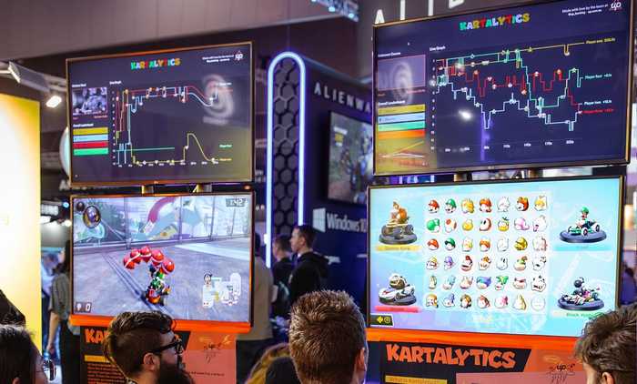
From the gaming side, we made some significant upgrades to the tech running our custom Kartalytics software, including the Choke-o-meter - a chart in the bottom left showing the highs and lows of your position across 6 races -and some hardware upgrades letting us run multiple Kartistics at once!
See more photos from PAX19 on our Facebook Gallery.
Meet Up #1, Spring Tree Edition (Oct 2019)
In October 2019, Up turned one year old. To celebrate we hosted a Spring Tree, Meet Up which was a great chance to have a chat with current Upsiders and also to let them know about some exciting additions to our public product roadmap - The Tree of Up. Meet Ups were definitely something people responded to well - all 350 tickets sold out in 8 minutes.
As our first meet up, Spring Tree gave us the chance to develop some custom branding and visuals we can continue to use. We produced all manner of collateral: invites; stubby holders; lightboxes; tees and a custom photo wall, that all helped bring this event together visually.
It was also the perfect opportunity to refine the lightbox designs once again, with nicer finished casings, brighter lights and bolder prints. Each lightbox can now be individually powered, stacked and have its artwork adapted as needed. It was a real milestone for Up - as a business and a brand!
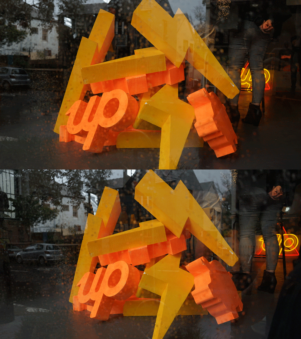
We also loved our signature 3D foam cutouts and the Panama Dining Room gave us the perfect backdrop to frame them up as part of a visually compelling environment.
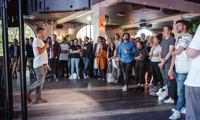
We used the Up 3D cutouts again in the Up photo booth, where Upsiders had some serious fun in front of the cameras and a giant Up media-wall. You’re such a photogenic bunch!
See more photos from our Spring Tree Meet Up here.
Bringing it all together.
As you can see, there’s lots of moving parts in our event design process. Events never end up exactly as planned, as things move and change and there are always plenty of unknowns, but this is a big part of the challenge.
A little over a year ago we could not have imagined setting up an installation at Pause Fest alongside Adobe, or running our Mario Kart Challenge alongside the likes of Nintendo and Twitch at PAX. Looking back and seeing how far we’ve come and what we’re capable of makes it really exciting to think about what comes next. It’s incredible to be part of such a lively team.
We’ve loved meeting you all, hearing what you’re looking for and sharing Up’s journey. We can’t wait to share more of this great thing we’re building here in Melbourne...Up!
If you haven't signed up already, give it a shot! You won’t look back, and the next time you see us out and about, come say hi!
Just want to call out some of the great humans we had the privilege of working with while making Up events a reality:
- CIP— Pete Johnston & Fleur Salisbury, Creative direction and event management
- Design and Deliver — Audio visual
- Taylor’d Press- Print: digital and letterpress
- Hanan Displays— Signage and physical builds
- Curve Comms — Fee Townsend, public relations
- Creffield— Many last-minute poster prints
- Mira Levina— Pause Fest photography
- The Up engineering team for their kartalytics side project
...and the supportive partners at Bendigo Bank and Ferocia. 👌
Hannah Gibson
@aitchgeewizzGet the gist
We’ll swing our monthly newsletter and release notes your way.
