The Evolutionary Design of Up
Sep 22, 2020 · Building Up
When we launched nearly 2 years ago, we declared our first principles approach to banking:
“Challenge the assumptions and limitations in banking and re-evaluate them from a more current point of view."
This statement did not come out of a contrived workshop, or committee, or a board of investors. It was the resonating sentiment of a team that had spent years in the weeds of banking software and its bureaucracy. Existing banks have too much baggage to be able to see the future of banking for what it could be. They lacked the courage to really re-invent themselves. Some questions that emerged from that period:
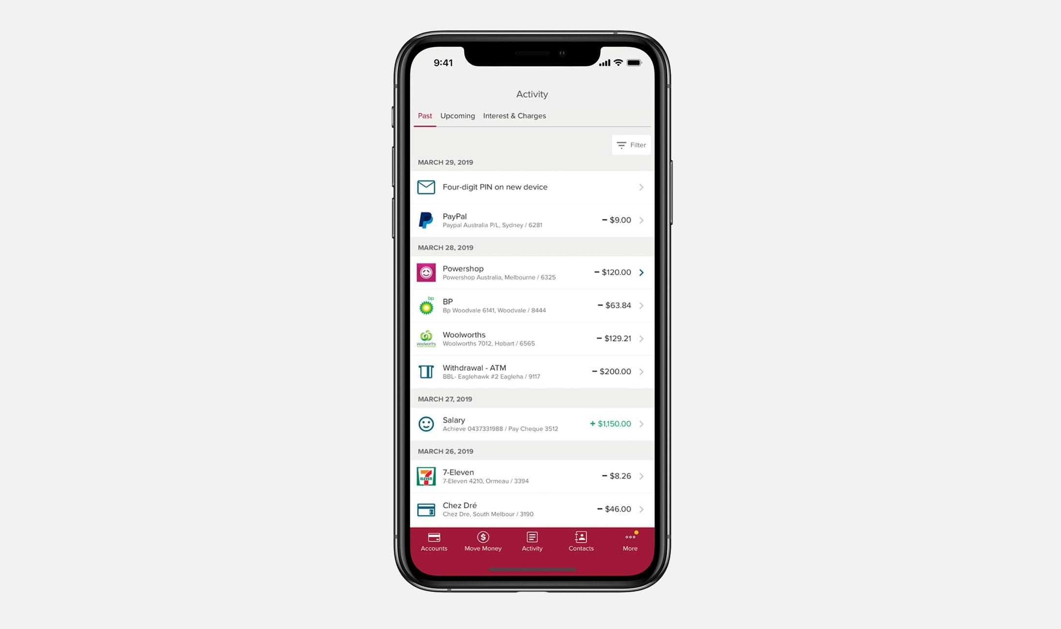
- Why doesn’t every transaction have a timestamp, a merchant logo?
- Why are all my payments to a particular person not grouped?
- Why isn’t it easier to pay someone I’ve paid before?
- Why am I sitting on hold on my phone to resolve an issue?
- How can saving money be fun and engaging?
We knew that if we followed our noses and solved these user-centric problems, and many others of course, that winning customers would take care of itself. We now have over 280,000 Upsiders and counting.
Making Feedback Easy
Up does not do traditional user testing. There, I said it. That’s our dirty secret.
We think there are other techniques that are faster and better indicators of real-world behaviour. We also believe we have two advantages:
-
An innovation mindset
-
A deeper relationship with our customers than any financial institution in Australia
Much of banking is a known problem space. We feel like we're taking a more creative approach to the problem, but that's not to say we don't rely on user feedback. Our Talk to Us section encourages Upsiders to give us feedback or suggest ideas. To date, we have received over 6,000 ideas via this channel, making it one of the most crucial conduits into the minds of our customers. We also have other highly-engaged channels such as our socials and the newsletter where we hear, almost instantly, what customers think of what we’ve delivered.
Engagement Is the Name of the Game
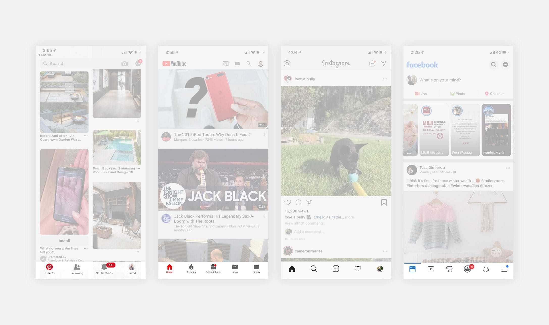
So where do we get our inspiration? It's rarely in the banking or fintech space. These are the apps that exist on billions of devices and set the bar for mobile digital experiences:
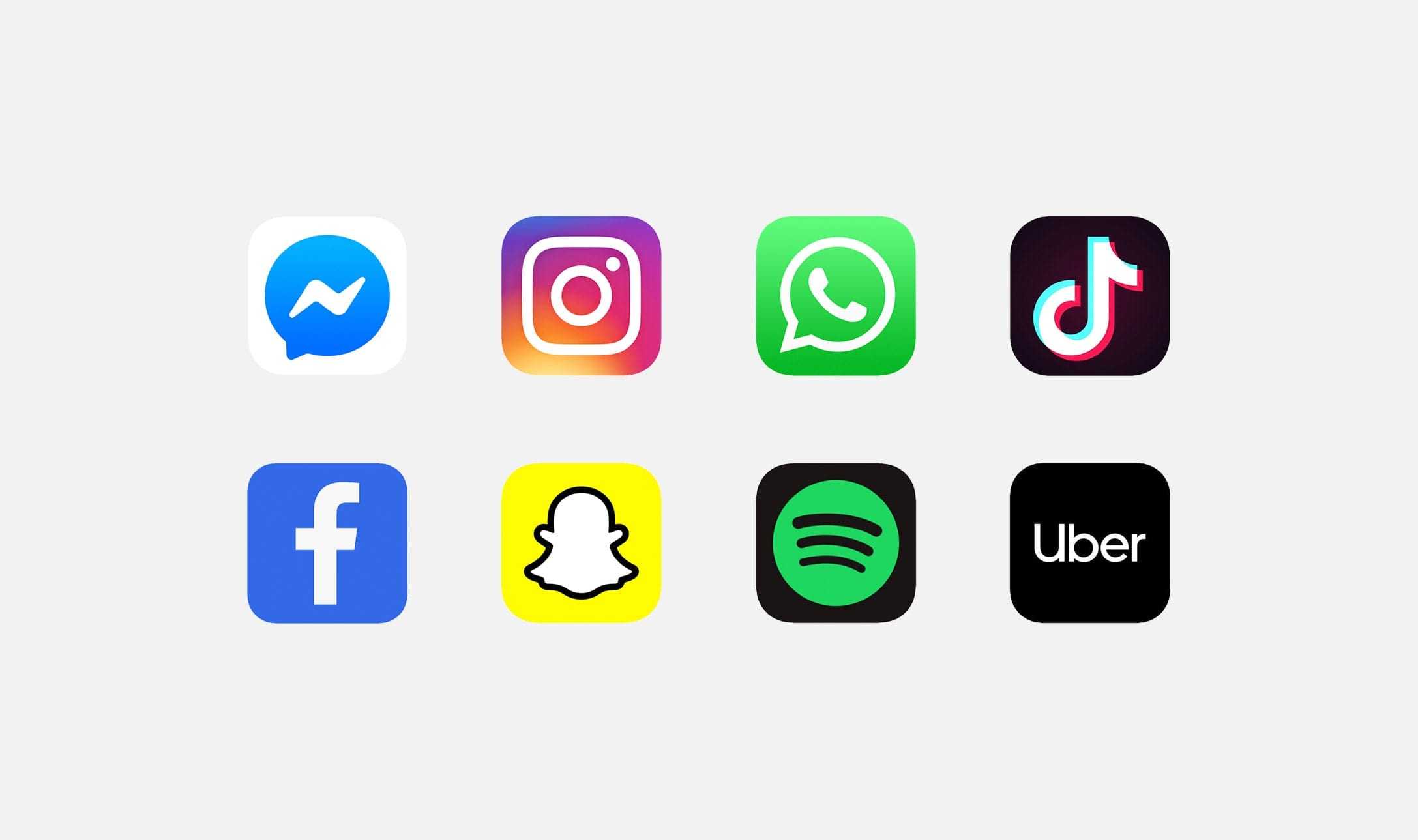
While they vary in purpose, their collective dominance in the landscape means they teach and familiarise patterns to expect when using our phones.
- How does TikTok allow you to react to content quickly and effortlessly?
- What similarities are there between Whatsapp, Messenger and Instagram when conversing with friends?
- When explaining new features what language do these platforms use? When do they use visualisations? When do they use words?
- When is Snapchat playful and when is it serious?
- Do I identify with my real name or username for Instagram? What about Facebook?
As users we immerse ourselves in the apps that have nailed engagement. While acknowledging the patterns they establish, we also appreciate the balance between knowing when to follow them and when to do our own thing. Up has a handful of atypical patterns, but as long as they are usable and intuitive they can become distinct moments used to engage and delight.
Why is it so important that Upsiders engage with the Up app? Aside from the opportunity to nurture a relationship through frequent interactions, we also think that being more engaged with your money encourages better financial literacy. It’s common that people fall into credit trouble by continuing to use their plastic cards without checking their balance regularly. By making Up an engaging experience, we’re making Upsiders more confident and connected to their finances.
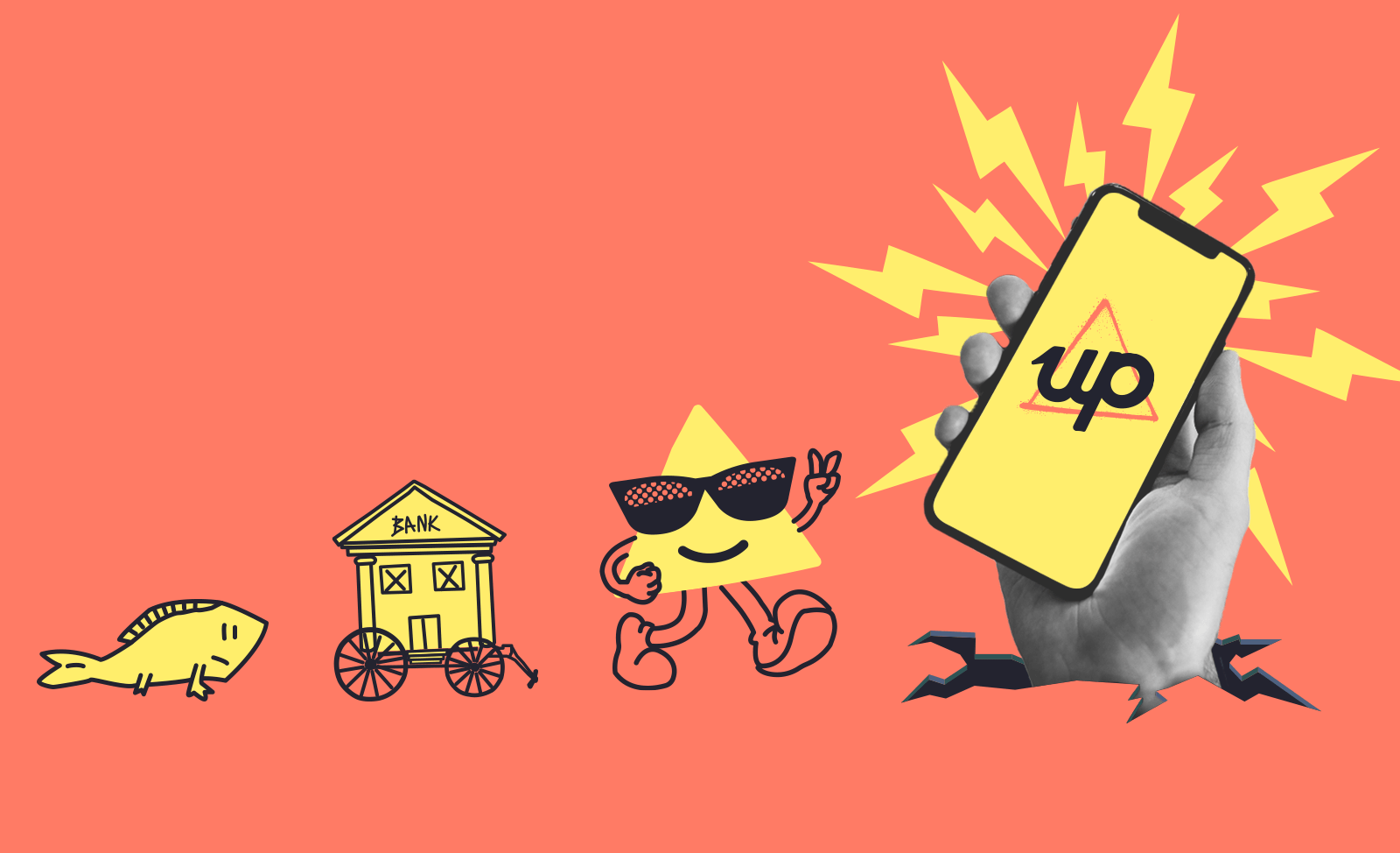
Becoming an Upsider
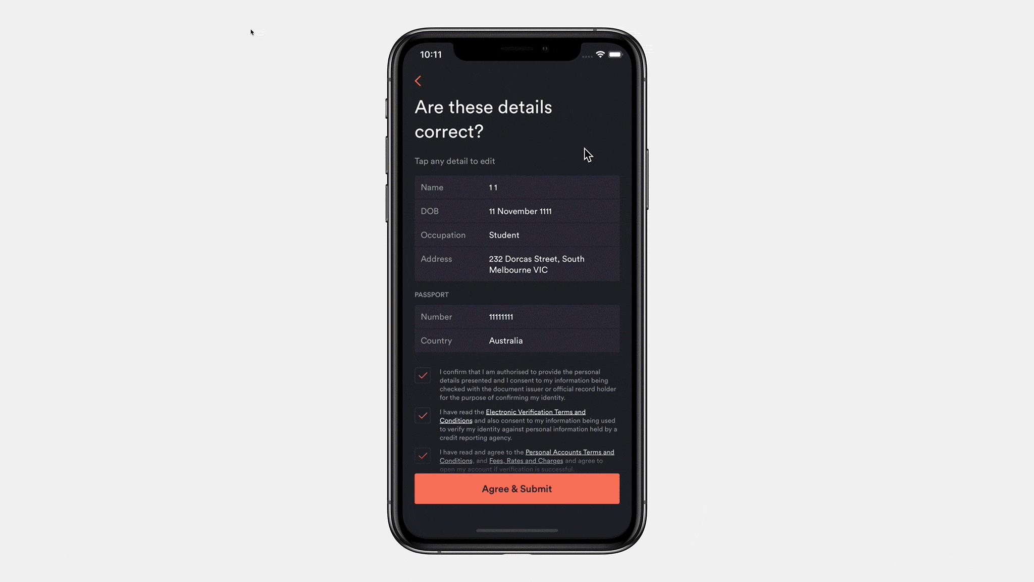
We’ve previously deep-dived on our card delivery experience. Before we could even get that far, we had to solve the huge problem of enabling people to sign up for a bank account without leaving the comfort of a mobile app — something that had not been done before in Australia.
We knew that the sheer amount of information we needed from the user was going to be a challenge. Banking is highly regulated in Australia, so we had to cater for many types of identity data (passport, license etc). Most apps can get away with just asking for a username, email and password.
Mobile flows tend to be atomic with a single input per screen, so with identity verification we were anticipating quite a long flow. Our focus was to trim the fat wherever possible, not just by reducing the total number of screens but also by making it easy for people to understand what was being asked of them as they progressed.
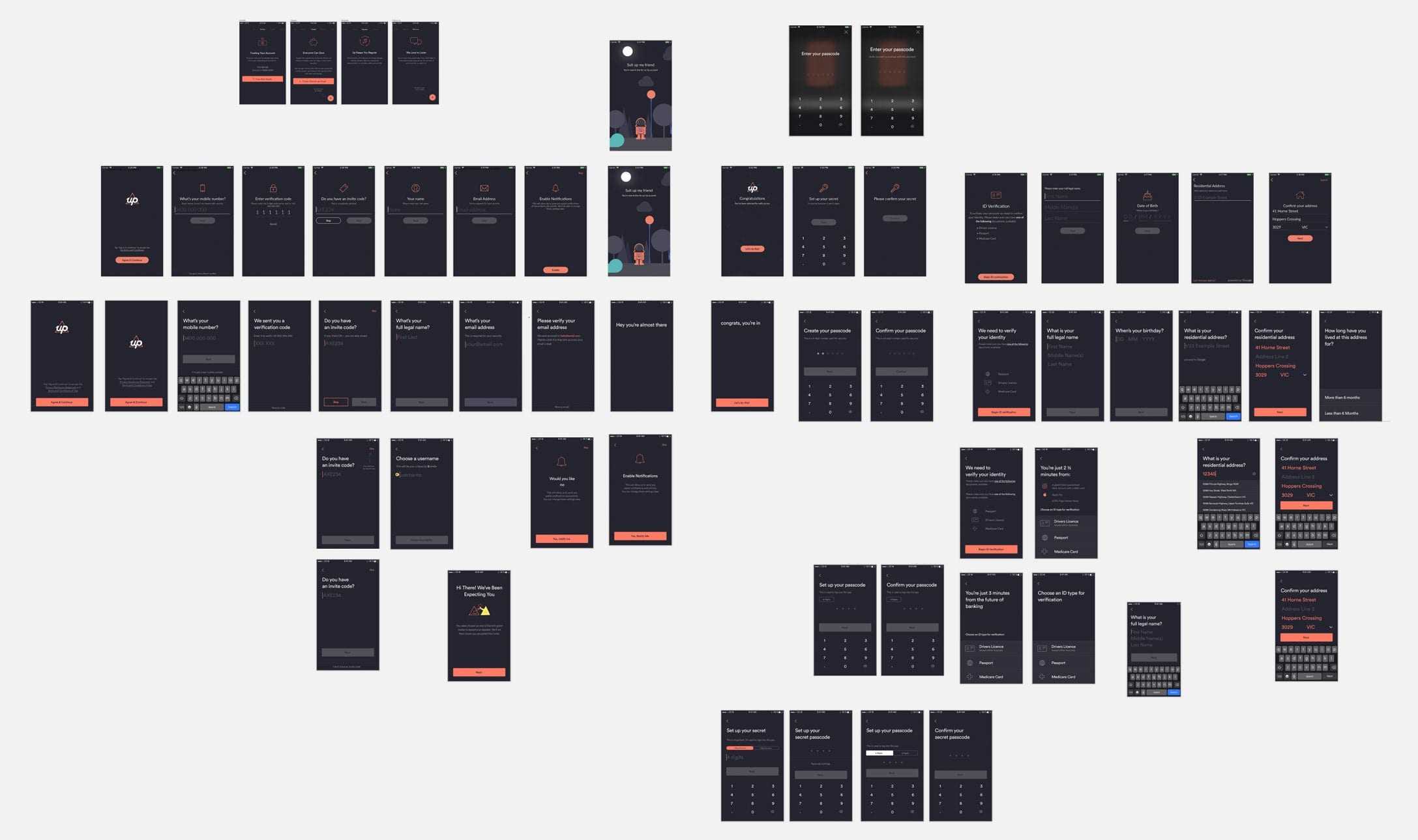
We fought to reduce the amount of data we needed to collect. Why does banking need to know your gender? We cut it. Do you need your card sent to a PO Box? We’ll give you a contextual experience based on answers you’ve already provided rather than a scrolling form full of fields. As we tested the new flow amongst ourselves and with beta users from our waitlist, we made a few changes:
- Anchoring buttons to the bottom of the viewport, and making them full-width. Close to your thumb and easy to hit.
- Removing anything extra like images, so you could move faster without distractions.
- Using conversational instructions (eg “What is your mobile number?” Instead of “Enter mobile number”). And only using secondary body text when it was really necessary.
- Using example text for the input placeholder, so you'd know what the right info looks like.
All of these small iterations reduced the cognitive load for users and made it feel easy and fast, despite the number of screens. This granularity was important as there isn’t actually a single sign up flow, but several which vary depending on your circumstances and the information we are required to collect.
Up Yeah!
Once we became more confident in our onboarding flow and how streamlined it was becoming, you could feel the team were ready to ship it and move onto the next bit of work.
It’s easy to have the blinkers on when you have such a measurable and objective goal — get users into the app in under x time — but stepping back, we made the observation that although we’d nailed sign up speed, something was missing the first time you landed on your activity feed. A moment that should feel significant and celebratory — you’ve literally just opened a bank account in under 3 minutes through your phone — feels clinical and unimpressive. We appreciate great brand moments in digital experiences, most notably MailChimp’s use of emotive design throughout their email software.
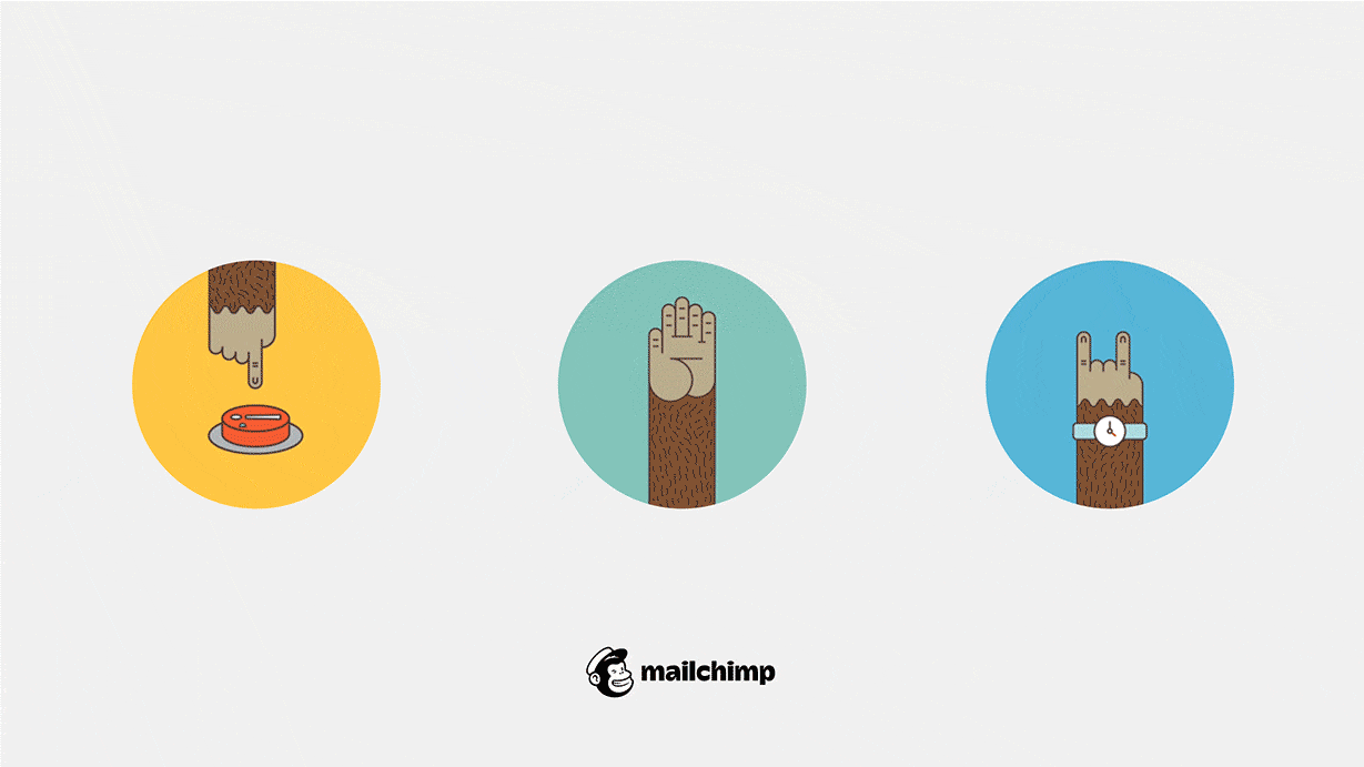
Email campaigns are stressful exercises — you can’t unsend them once they go out. It’s the nature of the beast. Interestingly, it was the arm of their mascot beast Freddie that was used in these cute but situationally-aware animations. The red button before launch, the high five once your campaign is live, and the rock fist for scheduled campaigns.
Our creative director Pete was eager to create a moment post-signup that made you go “f*ck yeah” in celebration.
Almost immediately after this launched it was being shared by new Upsiders and acknowledged through our feedback channels. Of course you only give yourself an opportunity for these moments if you are nailing the fundamentals. But this reinforcement encouraged us to lean into these seemingly frivolous treatments as a way to delight Upsiders while building a stronger brand.
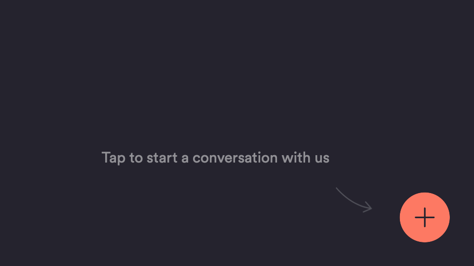
Logging in Sucks
Sometimes the design process involves considering what you don’t see as much as what you do see. For Up, removing the login screen is a great example of this. Banking apps tend to have heavy authentication flows before you see your feed or landing screen. It’s easy to see how this came to be; mobile apps came after desktop banking sites, and so inherited their secure lockdown context. And perhaps it goes back even further back to the mindset of “money belongs in a vault, behind a locked door”.
With all the technological advances in mobile device security, from the humble PIN code to sophisticated biometric recognition, it’s worth questioning some of the assumptions and trade-offs made in the name of security.
Logging in is a big friction point. Especially if we’re trying to help inform you about your finances.
There’s an interesting distinction that’s prominent in tech — the difference between security and privacy. If we break out of the world of banking apps and look at some of the apps we use each and every day – imagine if you had to enter a passcode every time you opened your email, or your messages? Yet if someone had access to either, they could reset every password you have and really cause you some headaches. We found a helpful albeit simplified distinction when approaching this aspect of the user-experience:
 | PrivacyProtecting information that is sensitive "Read Only" |
 | SecurityProtecting against being compromised financially "Write Access" |
A design decision we’ve made with this framework is removing the need to enter a passcode by default (which can be re-enabled in settings), and also when moving money where there isn’t any risk. Transfering between Savers doesn’t require you to use your phone’s authentication flow (e.g. passcode, Apple’s FaceID or Android’s BioAuth), but moving money into your spending account or sending money outside of your account (e.g. to another bank or via BPay) does.
Our philosophy is to ask for authentication where appropriate to maximise security, while also letting Upsiders enjoy the benefits of being more informed and connected with their money in a low-friction way. Our push notifications extend this by increasing visibility to your finances while still offering the preferences to protect your privacy.
Navigating Up
Like the sign-up flow, navigation is an area you address early when building an app from scratch. A solid convention in this space is the tab-nav, anchored to the bottom of the screen.
We even use a tab-nav on a banking app we built.
From that experience we learned that banking software can become quite large in surface area once you consider all the services offered. Tab-navs don’t lend themselves to being flexible and you can find yourself rearranging and regrouping items to fit a logical taxonomy. We also believe that the "hunt and peck" interaction while using tab-navs feels inelegant.
In contrast, the iOS home screen feels really usable when looking through your apps (and soon, widgets). Anywhere on the screen can be swiped, no aim required. This led us to create a unique but highly flexible and usable navigation concept. We could drop in sections as our services grew, and rearrange sections – or potentially allow users to – while being primarily gesture based.
Pull-to-Save
Our Pull-to-Save feature has an interesting backstory. Rather than being requested or envisaged directly, it emerged organically thanks to a few events.
- Round-Ups have been a staple feature of Up where your transactions are automatically rounded up to the nearest dollar (or even higher) and the difference is put into a Saver of your choice. A visually appealing by-product of this is that your activity feed contains nice rounded whole numbers. We noticed this drew attention to numbers that weren’t rounded — often your available balance 🤪.
- Anson would sometimes talk about when you return home after an outing and empty the spare change from your pockets into a jar or your car console. He was curious about this habitual saving behaviour, and how we might replicate it within the app.
- The last piece of the puzzle was an engineering improvement we shipped called "silent push notifications". Simply put, this meant users were always seeing the most recent information and no longer had to pull on the screen to refresh its contents, common pattern across many apps. When finishing up this feature, one of our engineers asked me what we'd like to do with this interaction.

I showed an idea to Levi (someone equally passionate about interaction design) who quickly prototyped it up to see how it felt in the hand. The idea was to pull on the screen and flick the remaining cents from your balance across to your Round-Ups Saver. If your balance was a whole number, we’d flick over a dollar.

The fact that we were nervous about shipping this speaks to the cautious approach we have to gamifying banking. We needn’t have worried though because not only did our Upsiders love it, the long-term data shows an upwards trend in people making spontaneous contributions to their savings goals. In fact in the 18 months since we launched this feature, we’ve seen over 1 million dollars saved via Pull-to-Save.
Visualising Savers
Initially we shipped Savers with a safe donut-progress ring to visualise the amount against the goal. Typically in banking, seeing your savings balance is a detached experience, a status check. Off the back of Pull-to-Save, our appetite for making saving fun and engaging became pretty big. We wondered if there was a way to feel how full your digital piggy banks are. We gravitated towards volumetric concepts over our existing perimeter progress bar.
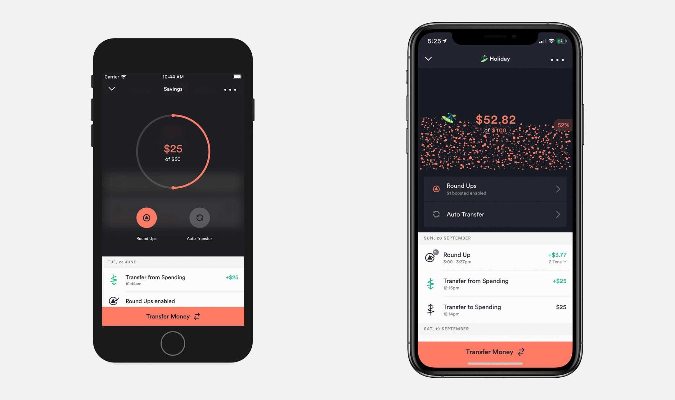
If visually a Saver was now a container, perhaps the contents could respond to your phones movement's, via the accelerometer. Maybe your Saver emoji could swirl around? Was there a way to feel this motion, through haptic feedback or vibration?
The importance of being mindful of the creative 'dial' during this part of the process can't be overstated. Knowing when to turn it up and when to show restraint. Variants and ideas were constantly shared with the team via mockups and prototypes, and feedback flowed.
What resulted was Saver Pools, a visually engaging and interactive experience with your savings.
Social Payments
We’ve previously touched on our belief that payments are a conversation and continue to iterate towards that vision. It's not about replicating social media features within our app, but rather understanding the why behind interactions in social contexts.
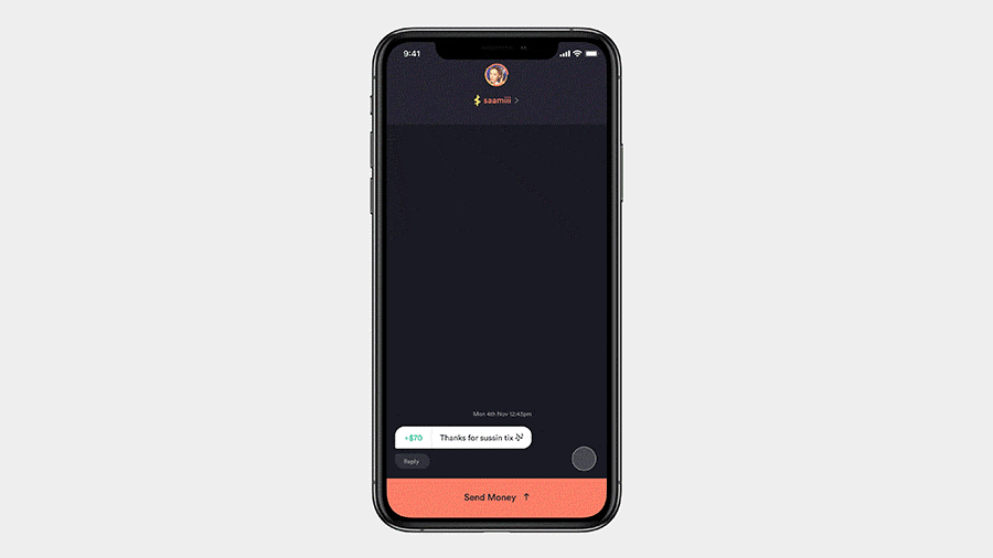
For instance, we often see users screenshot a confirmation screen as a way to prove they made a payment. We built payment replies in light of this, allowing Upsiders to very quickly give someone a thumbs up, react with any emoji or send a custom message in response to a payment.
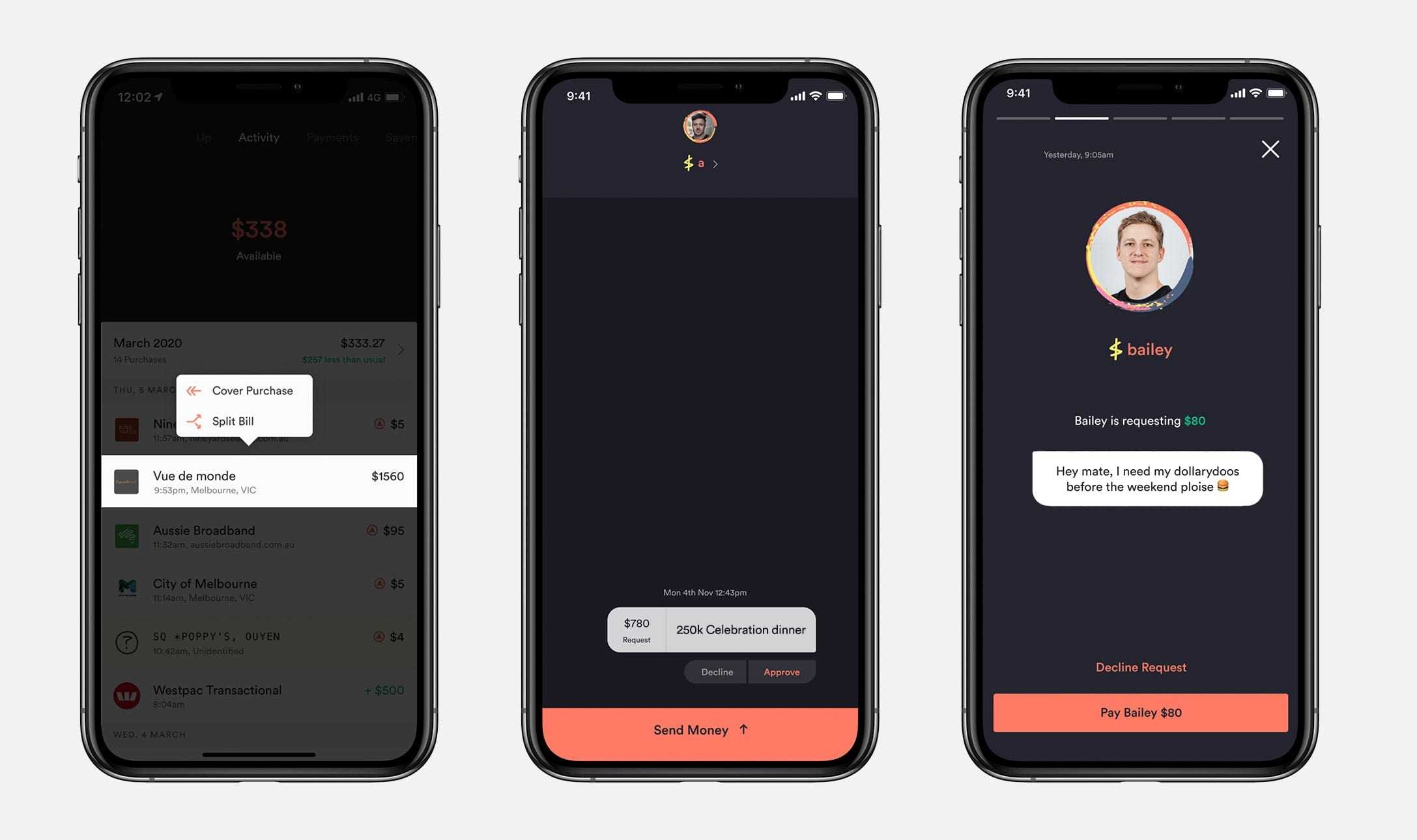
Soon we will ship more powerful functionality in the pursuit of understanding and creating social banking. Here’s a sneak peek of our initial thinking for bill splitting and requesting money:
Onwards and Upwards
We feel like we’re starting to make a real dent into the world of banking. Not only have we assembled and grown a passionate team, we've also forged a design process that empowers us to help our Upsiders be more connected to their money. There's a great sense of satisfaction as we see The Tree of Up fill out. Challenging limitations and turning them into opportunities is now a comfortable space for us, and given how connected we are with our customers, we feel we’re in good hands. The only way is Up.

Tags: Design, History, Innovation, Savers, Payments
Get the gist
We’ll swing our monthly newsletter and release notes your way.